
Travel Planner
End-to-End Mobile App Design | 140 hours | Solo Designer
Ideation
User Research
UX/UI Design
About the Project
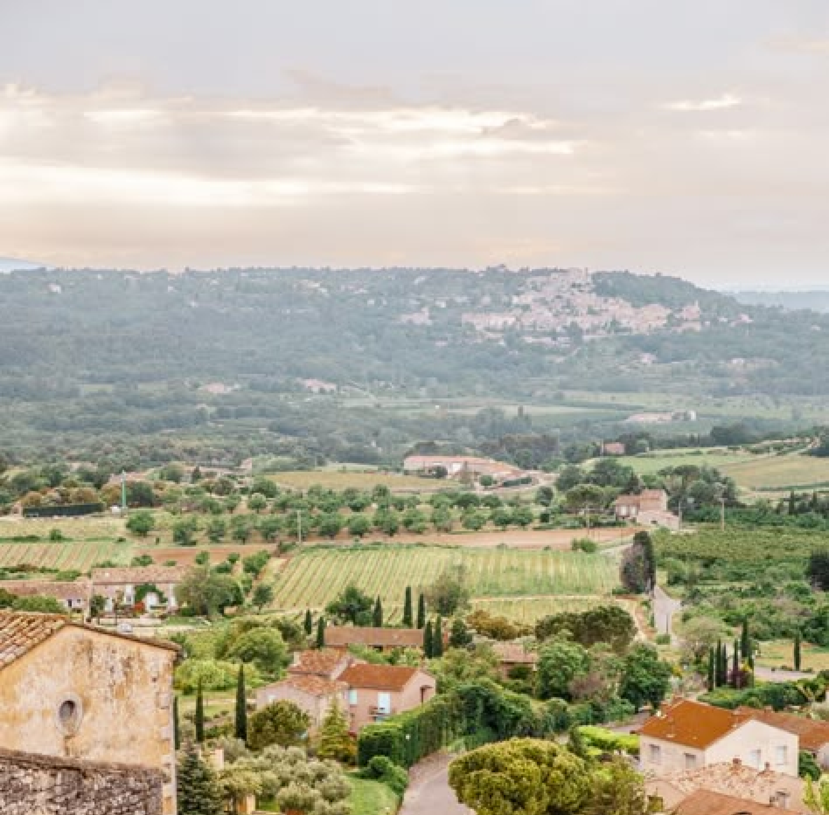
Adventerra is a travel planning app designed to help vacation travelers streamline their travel planning process, organize and manage their bookings, and alleviate the stresses of travel.
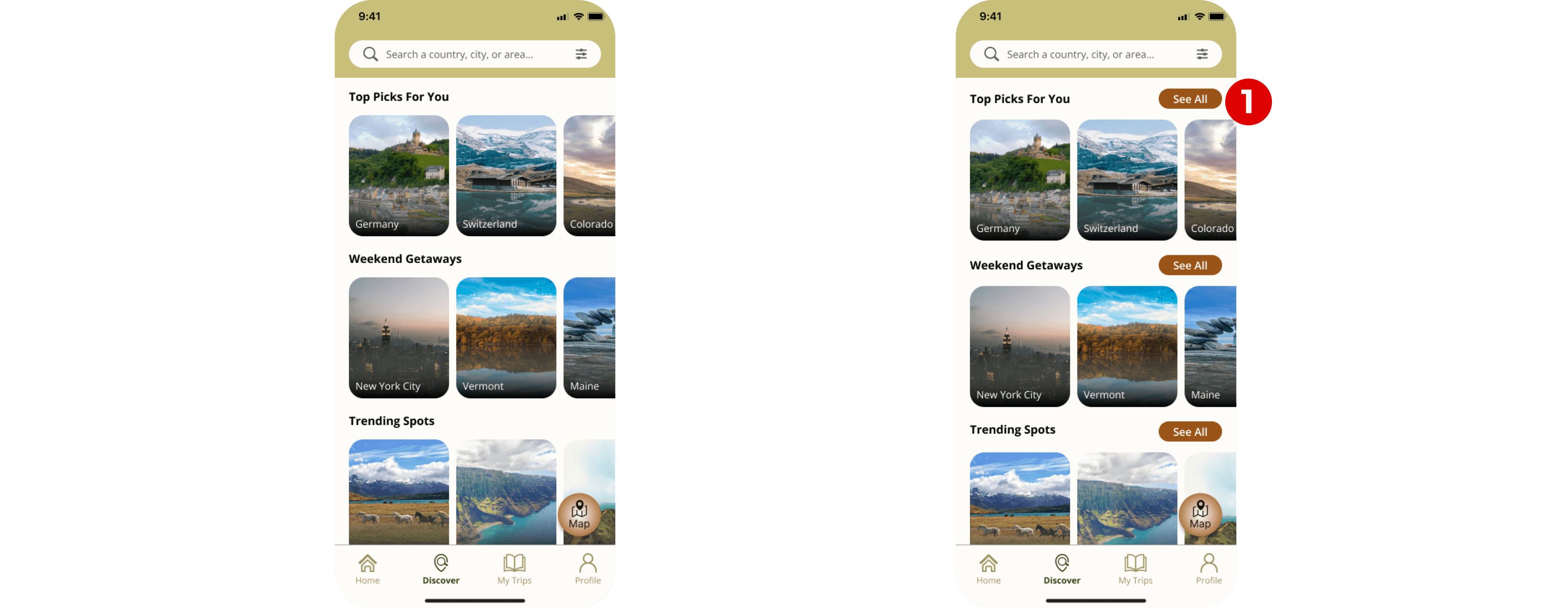
Discover
Find new trustworthy destinations and attractions personalized to specific interests
Create Itineraries
Create well-organized itineraries that can be followed and adjusted throughout the trip
Keep track of Bookings
Record and document every booking made to reducing the chance of booking mistakes
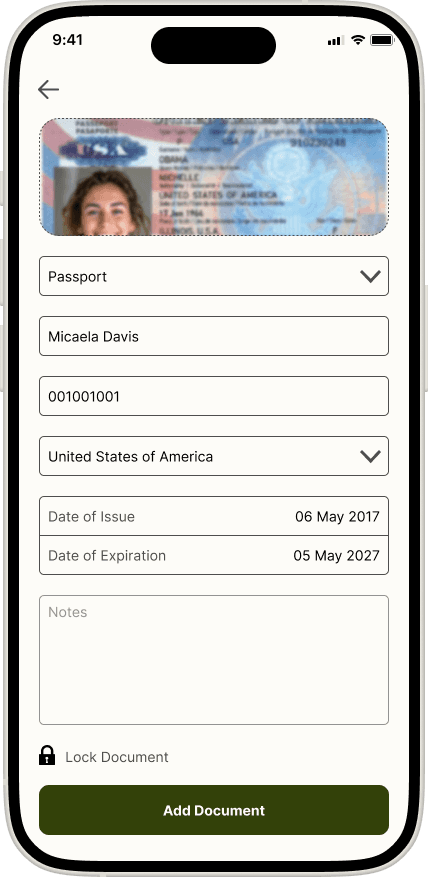
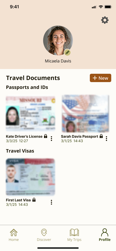
Store Travel Documents
Private and secure storage of travel documents with 2-step verification for easy access during travel
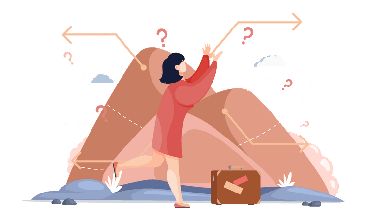
Problem Statement
With abundant travel information available, many travelers now plan their trips without the help of travel agents.
However, managing all the aspects of travel planning including research, bookings, documents, budgets, and journaling is challenging and often overwhelming, leading to overlooked details that impact the trip.
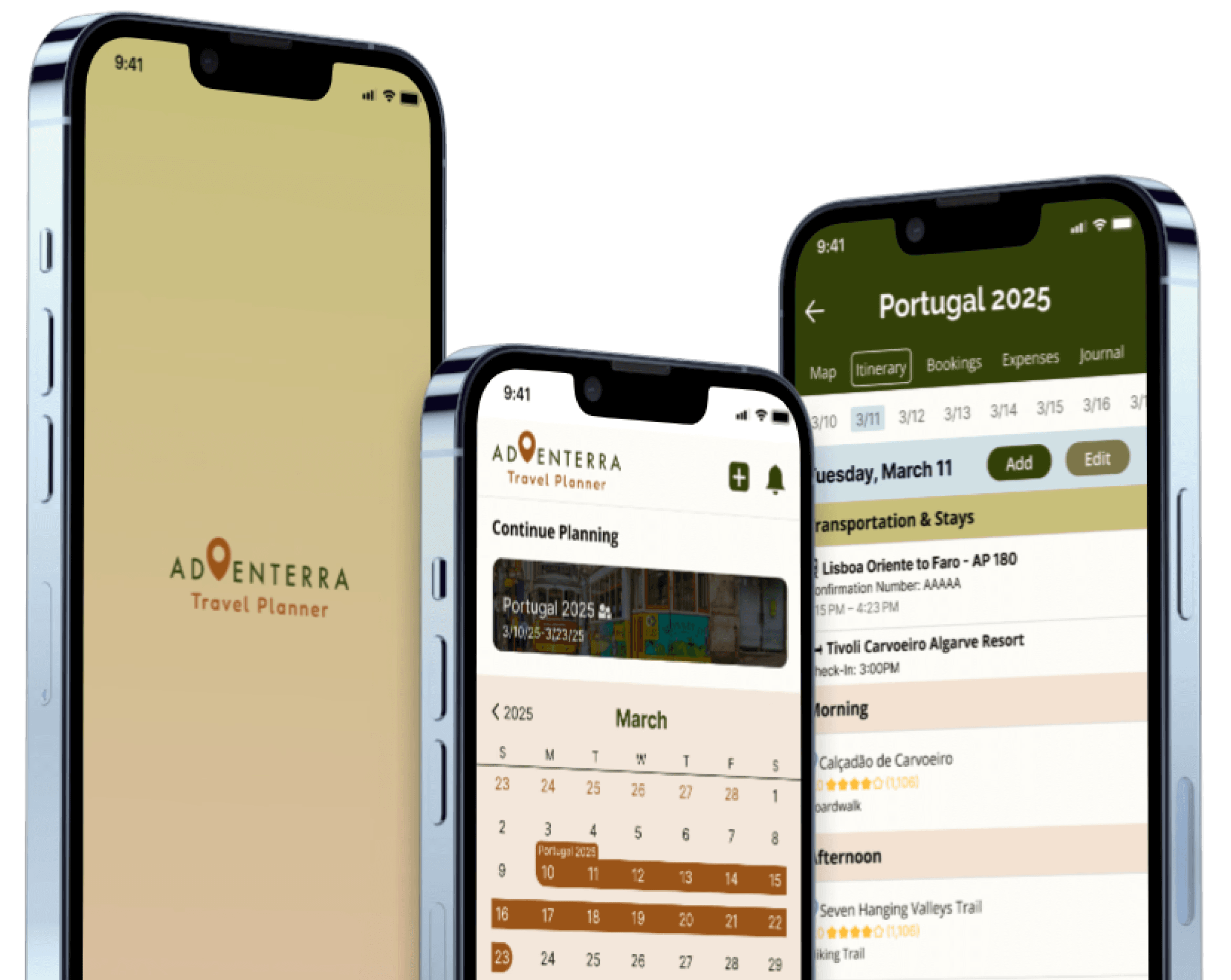
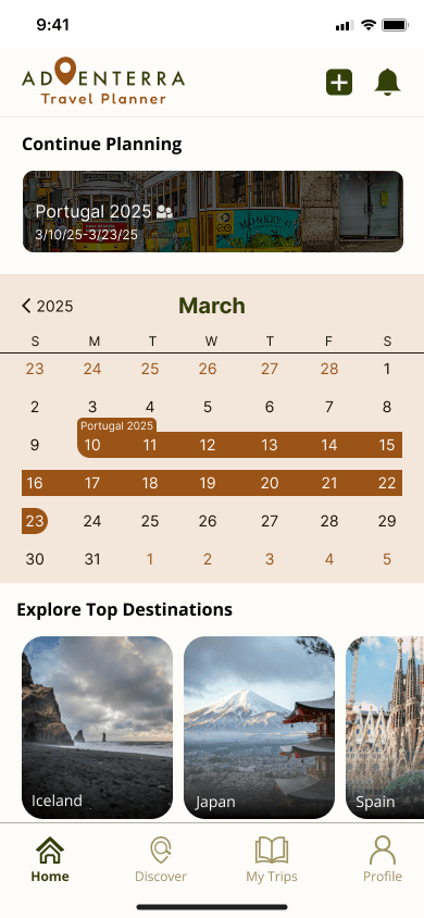
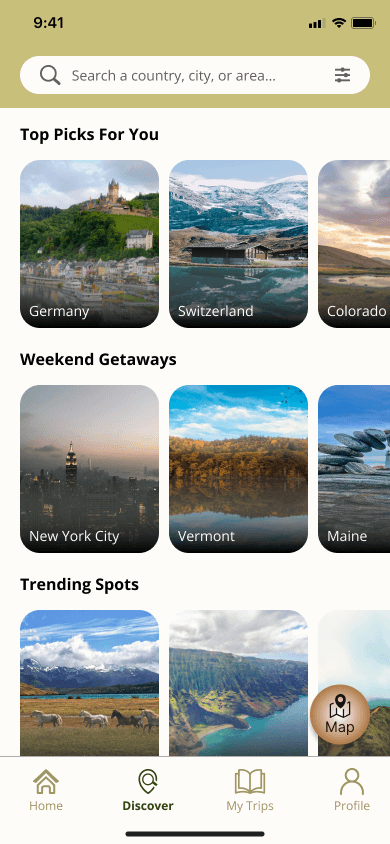
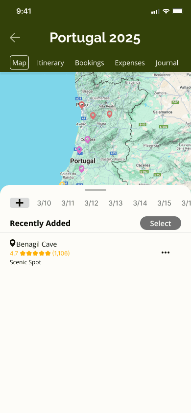
Final Product
Adventerra provides an engaging and intuitive travel planning experience. Here are some key sections of the app:
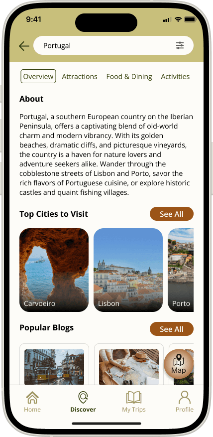
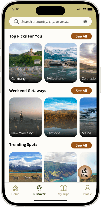
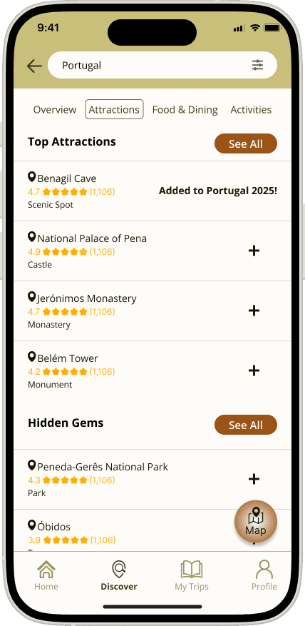
Discover New Destinations
Search for new destinations, attractions, and activities based on personalized travel preferences and add them to your trip plan.
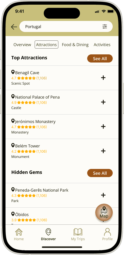
Organize Your Travel Plan by Date
Move saved attractions and activities to specific travel days and view them on a map to ensure efficient travel plans.
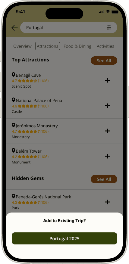
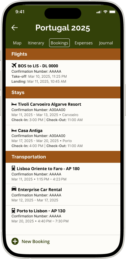
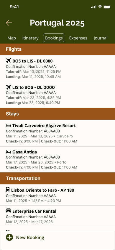
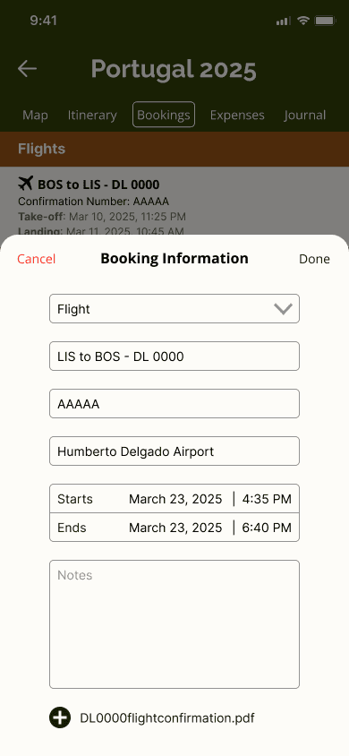
Add Booking Information
Collect and organize your bookings, reducing the risk of mistaken or double bookings.
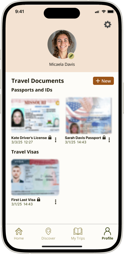
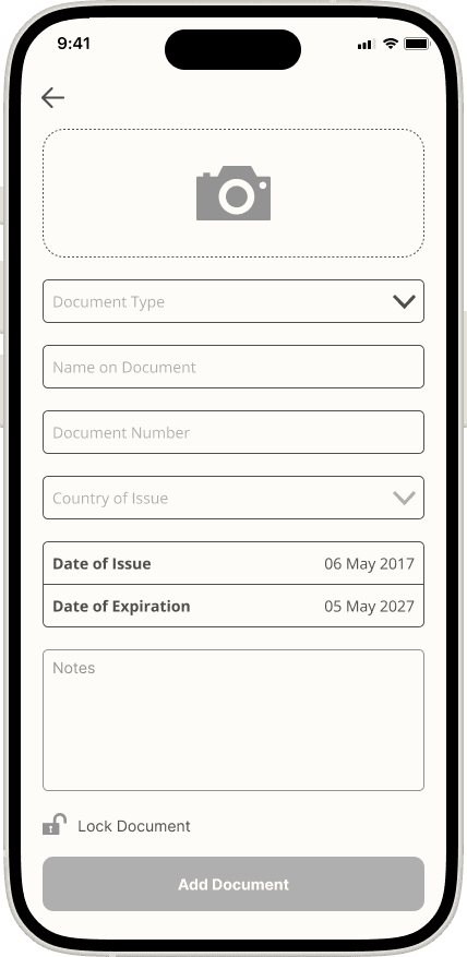
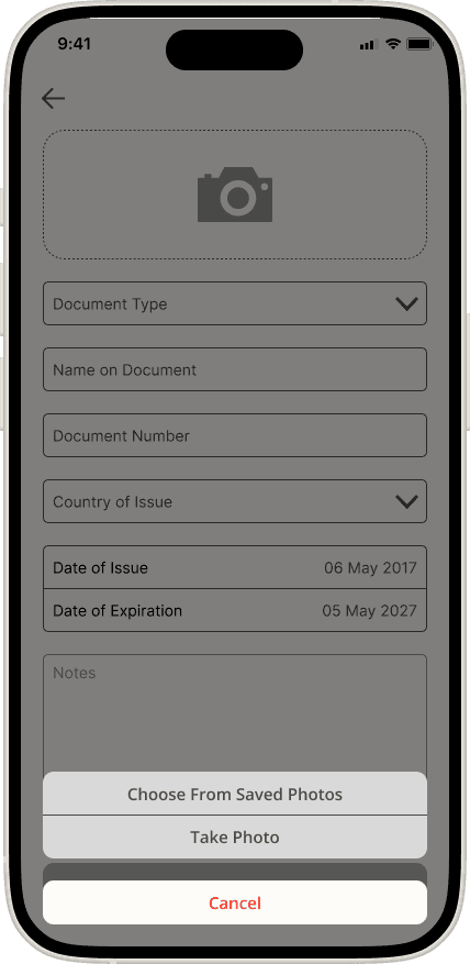
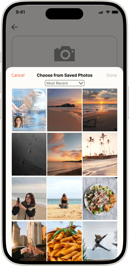
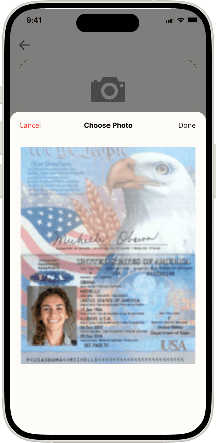
Upload Travel Documents
Upload and save your travel documents for quick and easy access during your travels.
Research Objective
My goal for this project was to discover what travelers struggle with when creating their own travel plans and how I could design an app that provides aid to their travel planning and improves their travel experiences.
Following the Design Thinking Process, I started investigating this problem by conducting competitive research to determine the market landscape and what travel products already exist. I then proceeded with a survey to provide me insights into key demographic information and overall travel planning experiences and followed with user interviews to get a deeper understanding of user pain points and needs.
Empathize
Define
Ideate
Prototype
Test
Research Methods
Competitive Research
To understand the market landscape of existing travel apps, I researched 4 competitive businesses that were all well-known yet provided different types of information that were directed to different audiences.
Two of the products, TripIt and Wanderlog, are travel planning apps that help users organize their bookings and trip plans that they make themselves. Booking.com and AAA Travel are platforms focused on helping their target users make bookings as a third-party site.
Strengths
Weaknesses & Opportunities
Threats

Booking.com
Large customer base, contracts with millions of flights companies, hotels, etc.
Provides cost comparisons with other agencies and guarantees lowest price
Global outreach and language options
Focus is primarily on creating bookings and not on trip planning and discovery
Travel recommendations are based on ratings which may not suit travelers looking for less touristy attractions and activities
Other competitors have significantly larger market presence in other countries such as the US, UK, and Italy

AAA Travel
Large company with many resources
Well established customer base due to multiple services provided
Large team of travel agents to work with customers
Rising popularity of social media trends and recommendations that the site does not follow
Too many different services categorized as different programs make it difficult for users to learn to use.
An increasing number of third-party booking sites that offer cheaper prices
TripIt
Easy transfer of booking info to the app
Real-time notifications of flight updates
Easy way of uploading and keeping track of travel documents
App does not help with trip planning
Missing opportunities to connect with social media
The app does not have any features that connect with transportation and ride-sharing services
Companies such as Google and Apple have developed on features that used to be exclusive to TripIt
Wanderlog
Users can create and follow other user’s itineraries for more creative travel options
Allows access to downloadable guides, maps and itineraries.
App can be improved upon in organization of content such as itineraries and how to search for information
Overwhelming amount of information and navigation has created a high learning curve to use the app
The app has too much information, difficult to sift through the information without more visual aids
User Survey
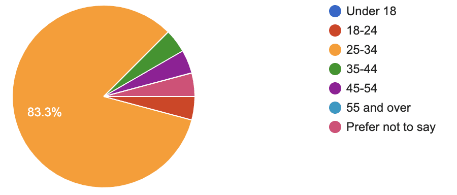
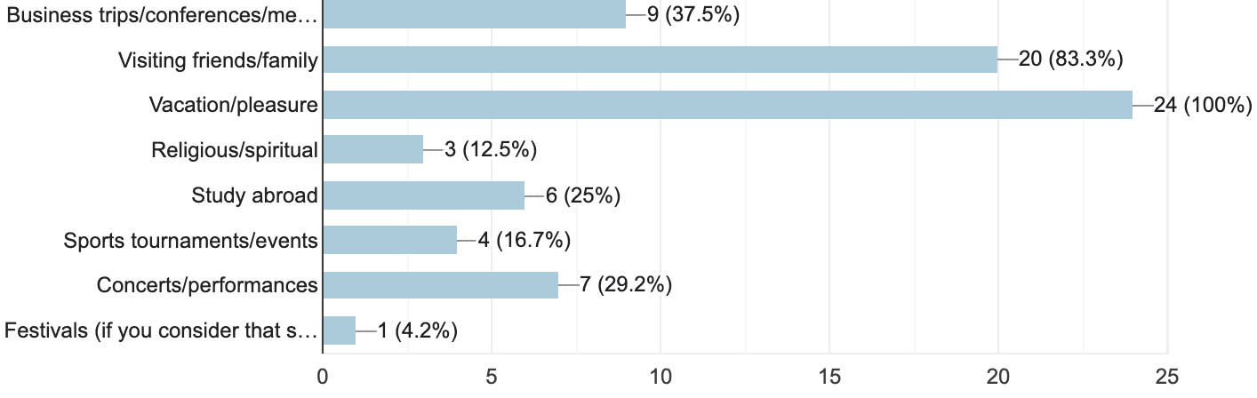
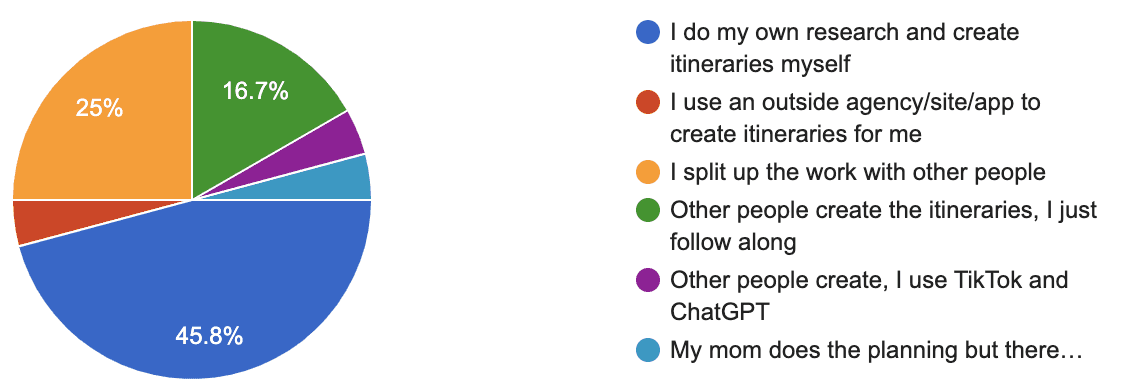
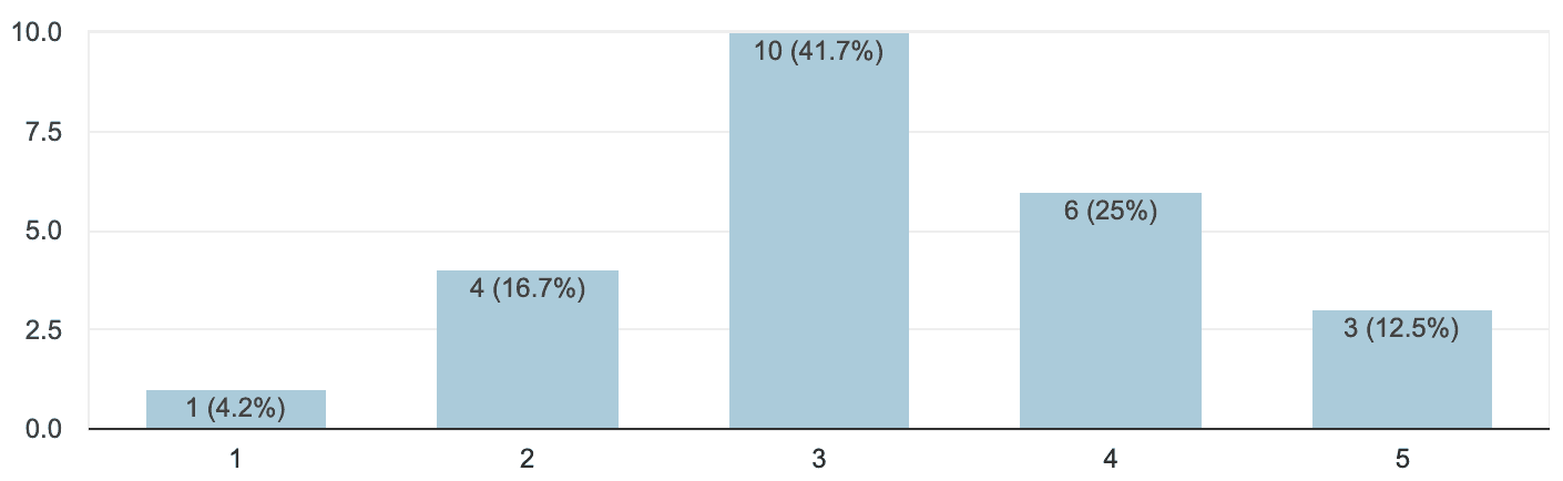
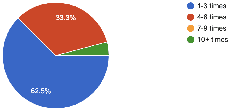
To collect key demographic and quantitative data on user’s travel experiences, I conducted a survey among 24 participants.
With participants who varied in their ages and citizenships, I was able to gain a lot of crucial insights into how often user’s travel, the reasons behind why they travel, and how they go about travel planning.
Here is a sample of some of the key survey questions that would help me determine my user interview participants and the topics of discussion during the user interviews:
Please select your age:
Which of the following purposes of travel have applied to you?
How do you create trip Itineraries/plans?
How important is trip budgeting to you?
How often do you make travel plans every year?
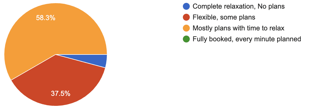
Which of the following describes your travel style?
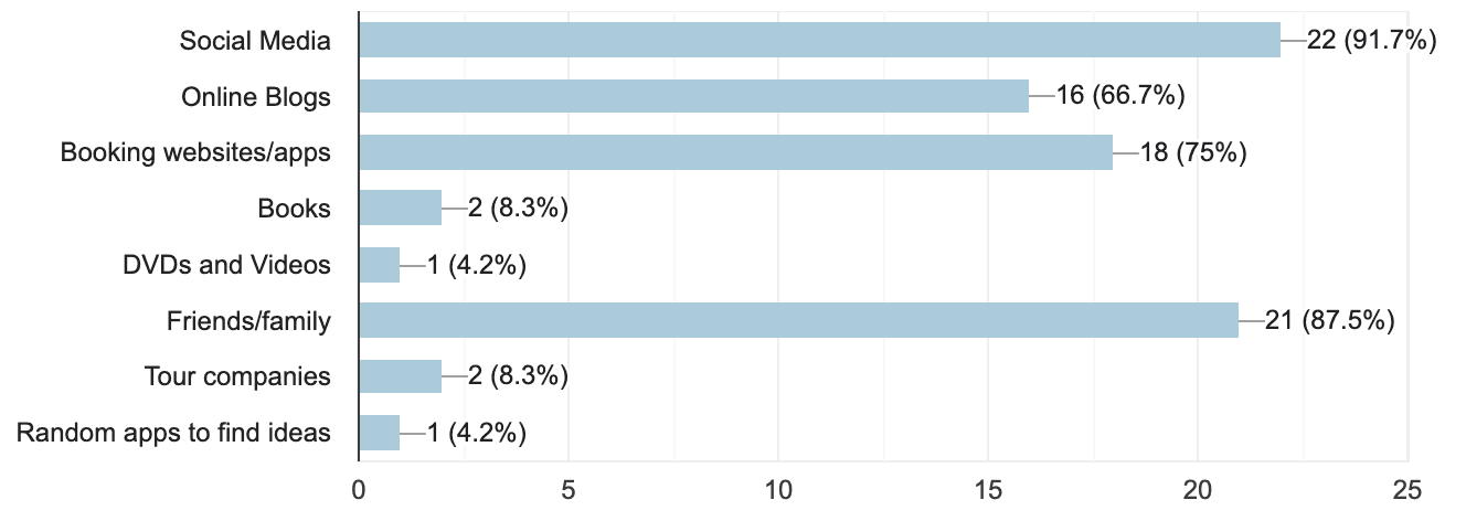
What resources do you use to plan a trip?
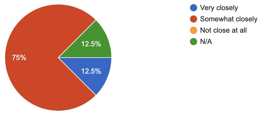
How closely do you stick to you budget during your trip?
User Interviews
With the results from my survey, I was able to narrow down my choice of interview participants by choosing those who traveled between 1-6 times a year and ranged between traveling with "flexible plans" to "mostly plans" to ensure that the interview participants had sufficient travel planning experience.
I then narrowed down my search even further to participants that varied in age, reasons for travel and who they travel plan with so that I could get a deeper understanding into a variety of different problems that people might encounter when trip planning.
My survey results helped me to determine 4 major topics to cover during my interviews:
(1) Travel Research and Planning
(2) Making Bookings
(3) During Travel Experiences
(4) Managing Travel Finances
(5) Sharing Travel Experiences
Here are some examples of interview questions that helped guide my conversation:
Travel Research and Planning
How do you determine your travel destinations and the timing of your trips?
Can you walk me through your travel planning process?
What are some factors you consider when you make travel plans?
Do you use an app or website to make lists and plan for a trip? If so, how was your experience using it?
Do you enjoy researching and planning for trips? Why or why not?
What do you find difficult about researching/planning for a trip?
During Travel Experiences
While you are traveling, how do you plan for each day?
How do you organize your travel documents during your trips?
Can you tell me about a recent experience with a mishap in your travel plans?
Making Bookings
What sites do you use for your bookings?
How do you keep track of your bookings?
Have you ever had any trouble booking for something?
Managing Travel Finances
How do you handle traveling finances in a group?
Do you have any difficulties managing travel finances?
Sharing Travel Experiences
Do you share your travel experiences online? If so, how?
Are there any ways you wish you could share about your travels?
With these main topics of conversation, I was able to get a deeper understanding of each travel lover’s experience in trip planning and gained a lot of insights into some of the problems that they encounter while they trip plan.
Information Consolidation
Affinity Map
With the information from my user interviews, I created an affinity map to group key insights together and determine common pain points. Here are the most commonly shared pain-points among my interview participants:
There is a need for a better way to keep track of bookings
It is hard keeping track of necessary travel documents and their expiration dates
Managing and splitting finances with a group of people while traveling is difficult
Documenting expenses during or after is tedious
Trip planning is overwhelming, there is too much information to parse through
User Persona
Based on my research findings, I created a user persona that reflected key audiences, and their goals, challenges, and needs.
Throughout the rest of the project, this persona was used as a reference to make key design decisions based on real-life needs and expectations.

Micaela Davis
Daring
Meticulous
Curious
Empathetic
MOTIVATIONS
Curiosity towards different cultures, cuisines, and landscapes of the countries she visits
To enrich her everyday life with new discoveries and experiences from travel
"Traveling and experiencing everything that the world has to offer is when I feel most alive.”
Brands & Influences


Age: 29
Job Title: Research Scientist
Status: In a Relationship
Location: San Antonio, TX
Character: The Explorer
BIOGRAPHY
Micaela Davis is a 29-year-old research scientist. When she’s not working in the lab, Micaela enjoys traveling both alone and with friends to visit natural landmarks and learn about different cultures and cuisines. Using Instagram, blogs, and YouTube videos, Micaela dives deep into researching her trips, and often finds it overwhelming, struggling to parse through all of the information needed for each trip. Currently, she uses Google Drive to hold all her bookings, travel documents, packing lists, and itineraries but has found it difficult to view on a mobile screen while traveling. Micaela also struggles to keep track of all her travel expenses and needs a way to collect, organize, and view them while she travels to control her spending. With an increasing number of trips under her belt, Micaela is also looking for a way to journal her experiences for personal memories, but cannot find the time to do so during and after her trips. With so many logistics to consider when planning a trip, Micaela is in search of an app to aid her in the travel planning process and facilitate more stress-free vacations.
GOALS
To take a break from her work life and adventure to unique natural wonders
To have stress-free travel experiences with carefully planned itineraries where she can make the most of her trips while giving her the flexibility to explore during her travels.
To keep track of her expenses easily and avoid overspending when traveling both along and in a group.
To record and summarize her travel experiences in an efficient way.
PAIN POINTS
Struggles to keep track of bookings when she is traveling
Finds travel planning overwhelming as there is too much information to parse through to create an itinerary
Has a hard time keeping track of finances when traveling alone and in a group.
Struggles to know the status of her travel documents and visas.
Wants to journal her adventures but can’t find the time.
NEEDS
An app to keep track of all her bookings
An app that caters to her travel preferences and can make personalized recommendations according to them
To easily record her expenses and calculate shared expenses with others
To keep track of the status of her travel documents and informs her when she needs to renew or apply for one.
To journal and record her travel experiences
Design Ideation
Venn Diagram
The creation of project goals further helped me to gain clarity and align the goals of parties involved in the project. With these project goals in mind, I was able narrow down my design features and begin the information architecture phase of my project.
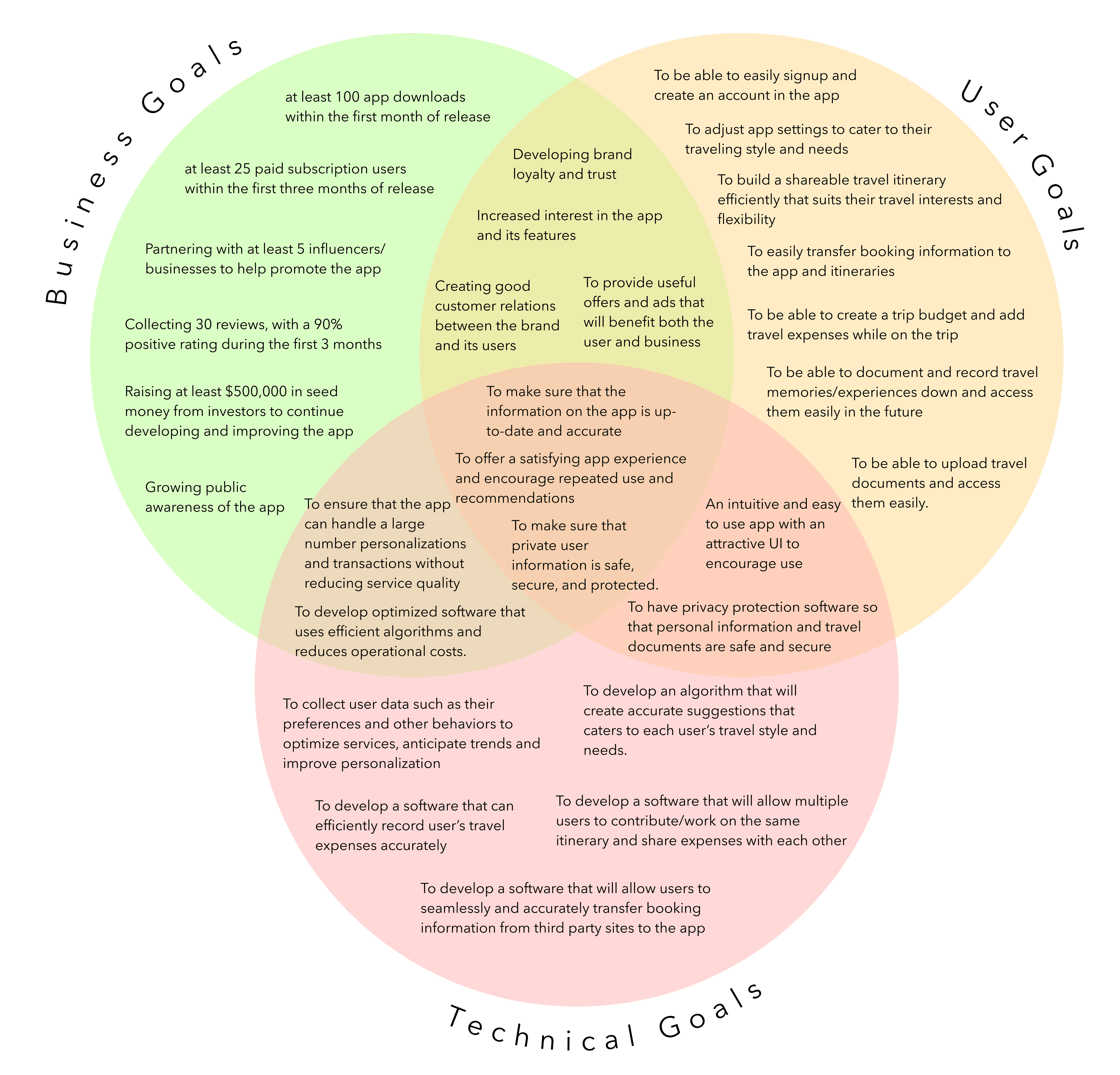
POVs and HMWs
With my Venn Diagram and user persona in mind, I was able to determine 3 POV statements and 3 corresponding HMW questions that addressed actionable problems for me to explore within my design ideas:
POV Statements
I’d like to explore ways to easily find attractions/activities that fit individual interests and efficiently build out travel itineraries because many trip planners find travel research to be overwhelming with the abundance of information out there.
I’d like to explore ways to organize and store booking information because many travelers find it difficult to keep track of bookings.
I’d like to explore ways of informing travelers on what travel documents are needed for their trips and how to make users feel secure about uploading personal documents on the app.
HMW Questions
How might we help trip planners find travel activities and attractions catered to their interests and needs so that they can efficiently build out a travel itinerary?
How might we organize bookings to reduce the chance of travelers creating missed or double bookings?
How might we organize and ensure the security of access to personal travel documents?
Feature Set
Using the POV statements and HMW Questions, I came up with a set of features and prioritized them into four categories based on their alignment with my user persona and Venn Diagram goals:
(1) Must-have
(2) Nice to have
(3) Surprising and delightful
(4) Can come later
Here are some of the high-priority features in my feature set:
Homepage
Puts forward shortcuts and most recent activity to increase usability
and efficiency.
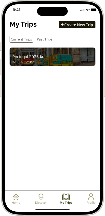
My Trips
Organizes travel information by trip. Users will be able to input travel information into each trip.
Discover
Allow users to explore destinations, activities and attractions that cater to their interests.
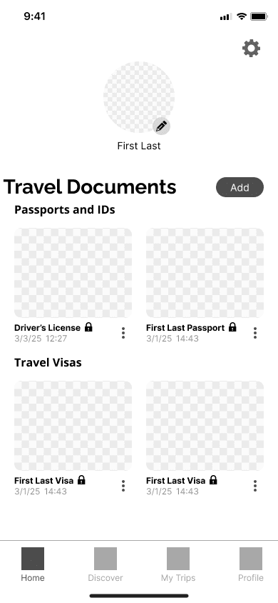
Travel Documents
Organize important travel documents and notifies users of documents that require renewal.
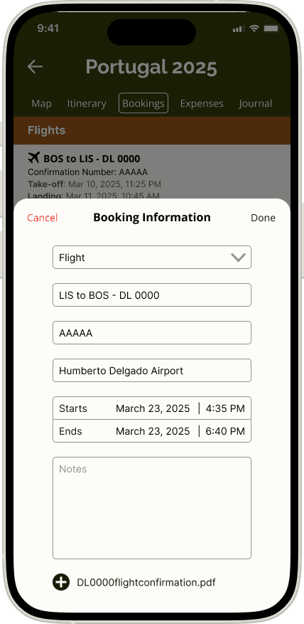
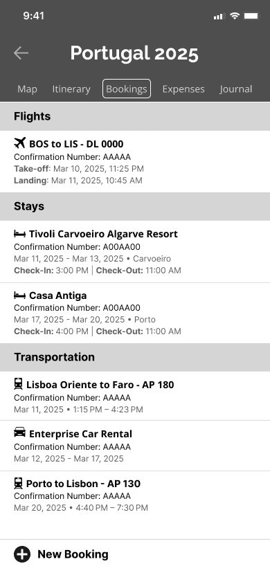
Bookings
Bookings will be categorized into sections such as "transportation", "stays", "meals" and more.
Travel Document 2-step verification
A 2-step verification option for travel documents ensures the security of personal information on the app.
Information Architecture
Card Sort Study
It was important for me to conduct a card sort study to identify how users grouped travel-related content into the pages and features that I already determined previously. To do this, I held a closed card sort with predetermined categories among 6 participants.
The results of this study would ultimately help to determine my sitemap and ensure that it would be intuitive to users.
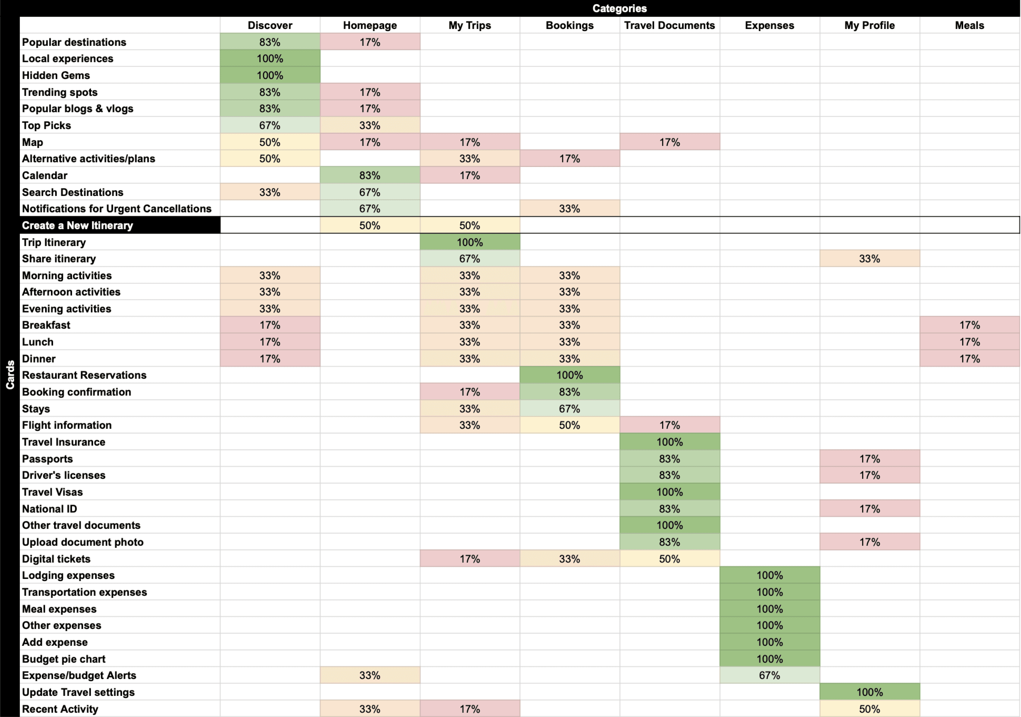
I was surprised to find that some participants had trouble placing (or had conflicting opinions on) some of the terms such as "Map", "Alternative activities/plans", activity and meals of the day terms, "digital tickets" and "recent activity". Upon questioning, it was discovered that this was mostly due to confusion as to what the term meant or referred to.
With the results of the card sort, I was able to gain important insights into the placement of most terms/features within the app and create an intuitive sitemap as many of the cards were agreed upon either unanimously or by the majority of participants.
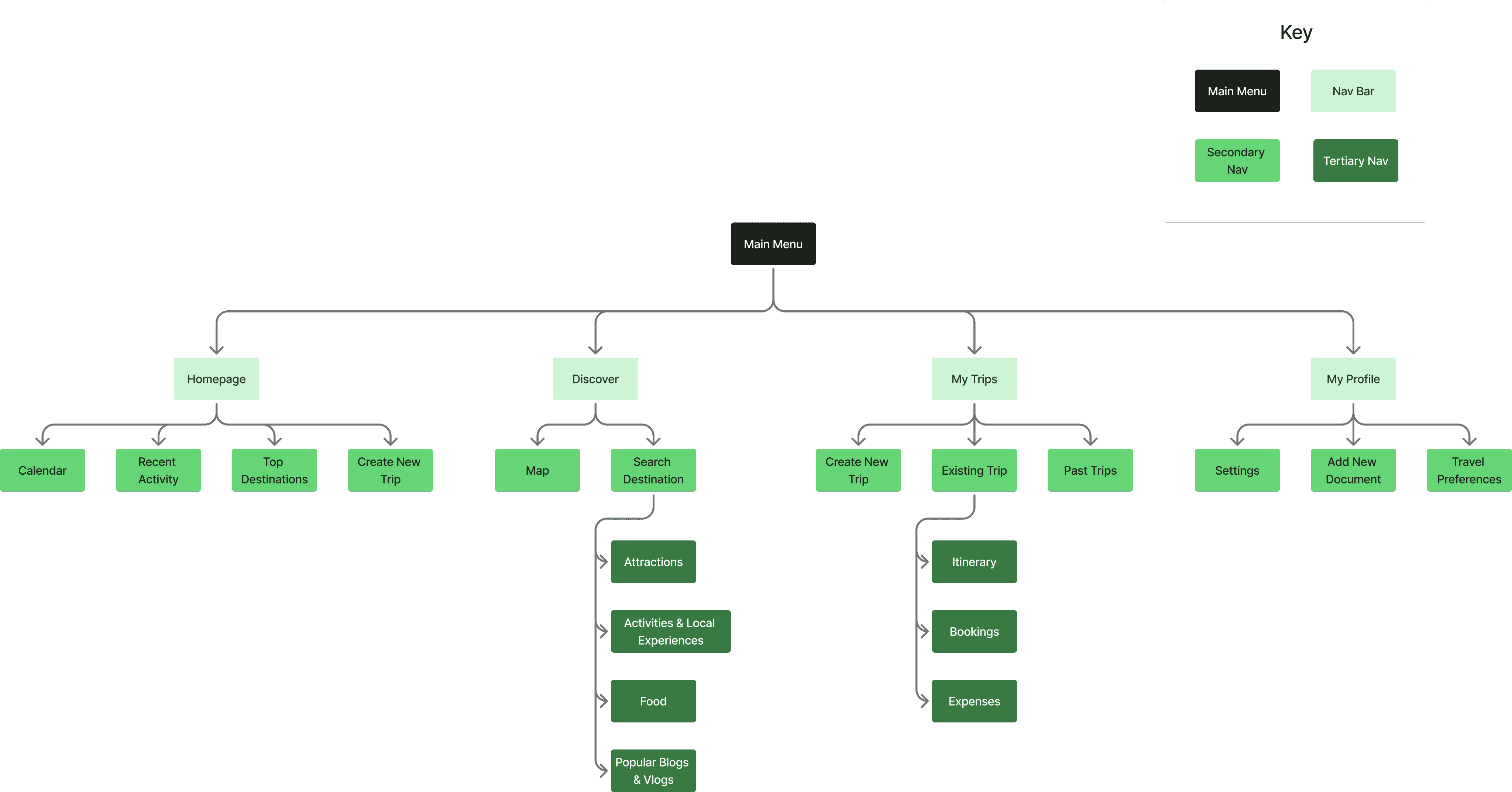
Sitemap
Using the results of the card sort study, I created an intuitive sitemap that I frequently referenced during the creation of user and task flows, navigational elements, and page designs for this project.
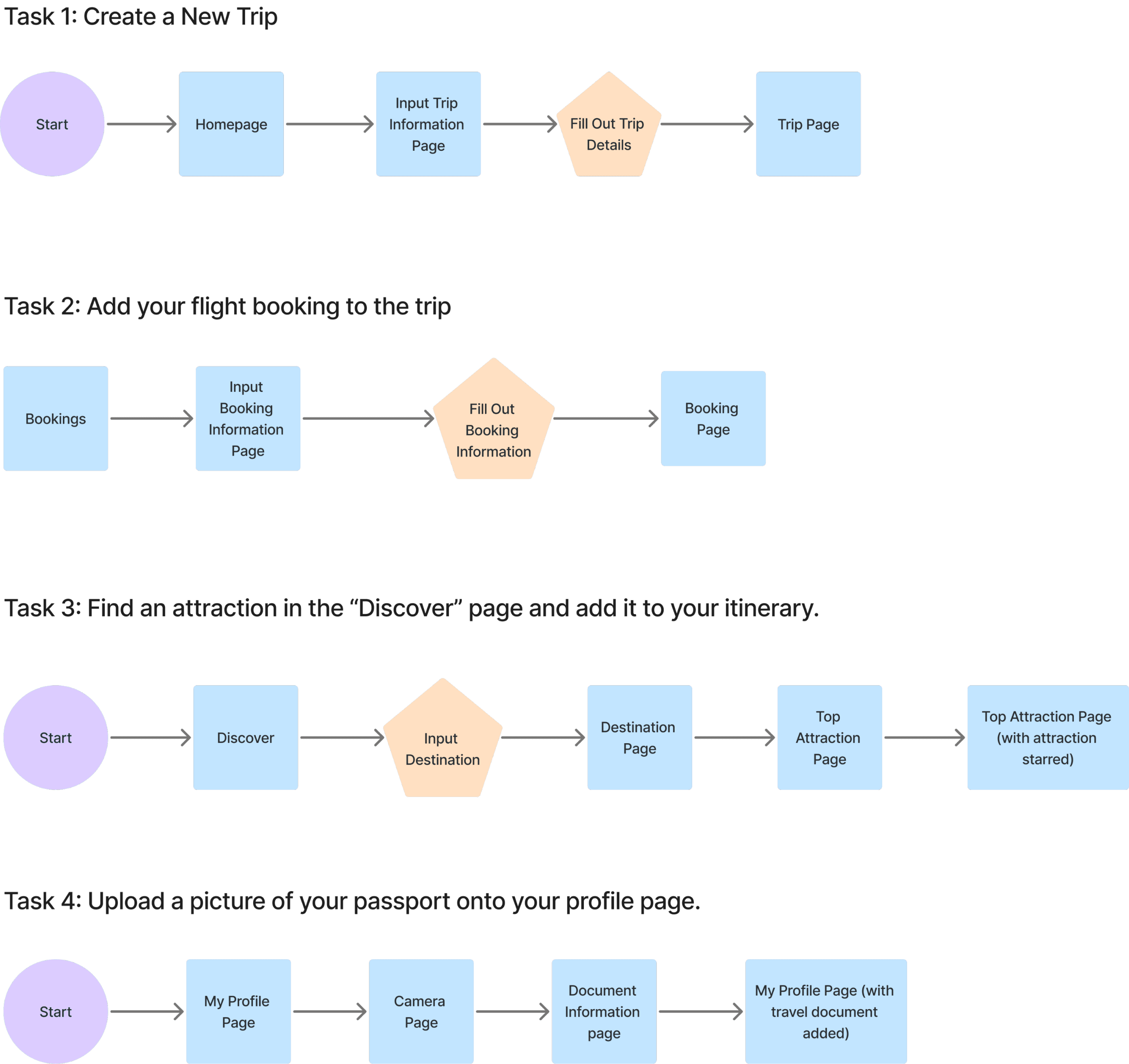
Task Flows
I then created 4 major task flows shown below which would be used in the creation of my user flows and during mid-fidelity and high-fidelity wireframe usability tests:
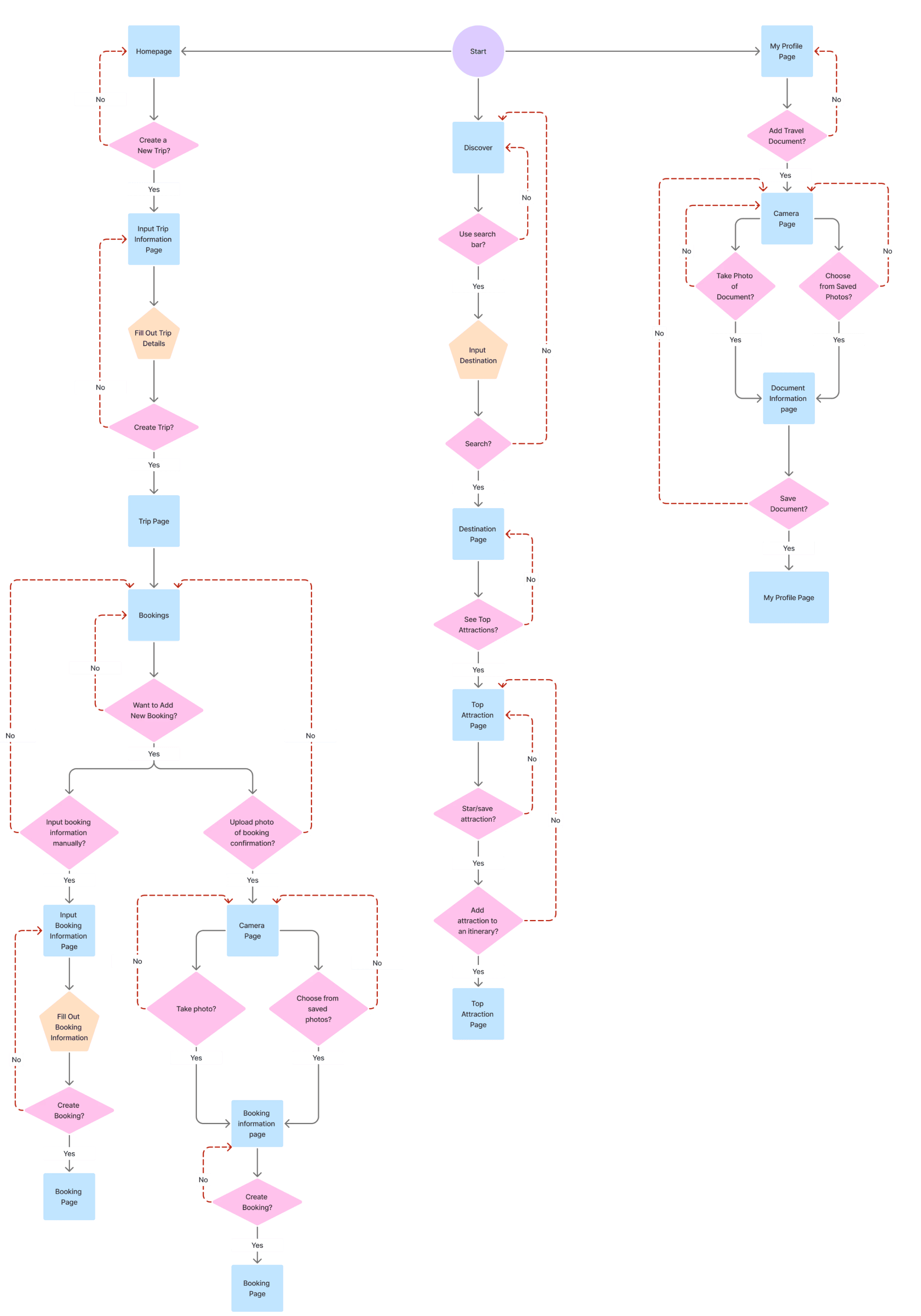
User Flows
Based on my task flows, I created the user flows that would help in determining the pages needed to be built out for my wireframes and to ensure that each task given to users during usability tests would flow smoothly.
Wireframes
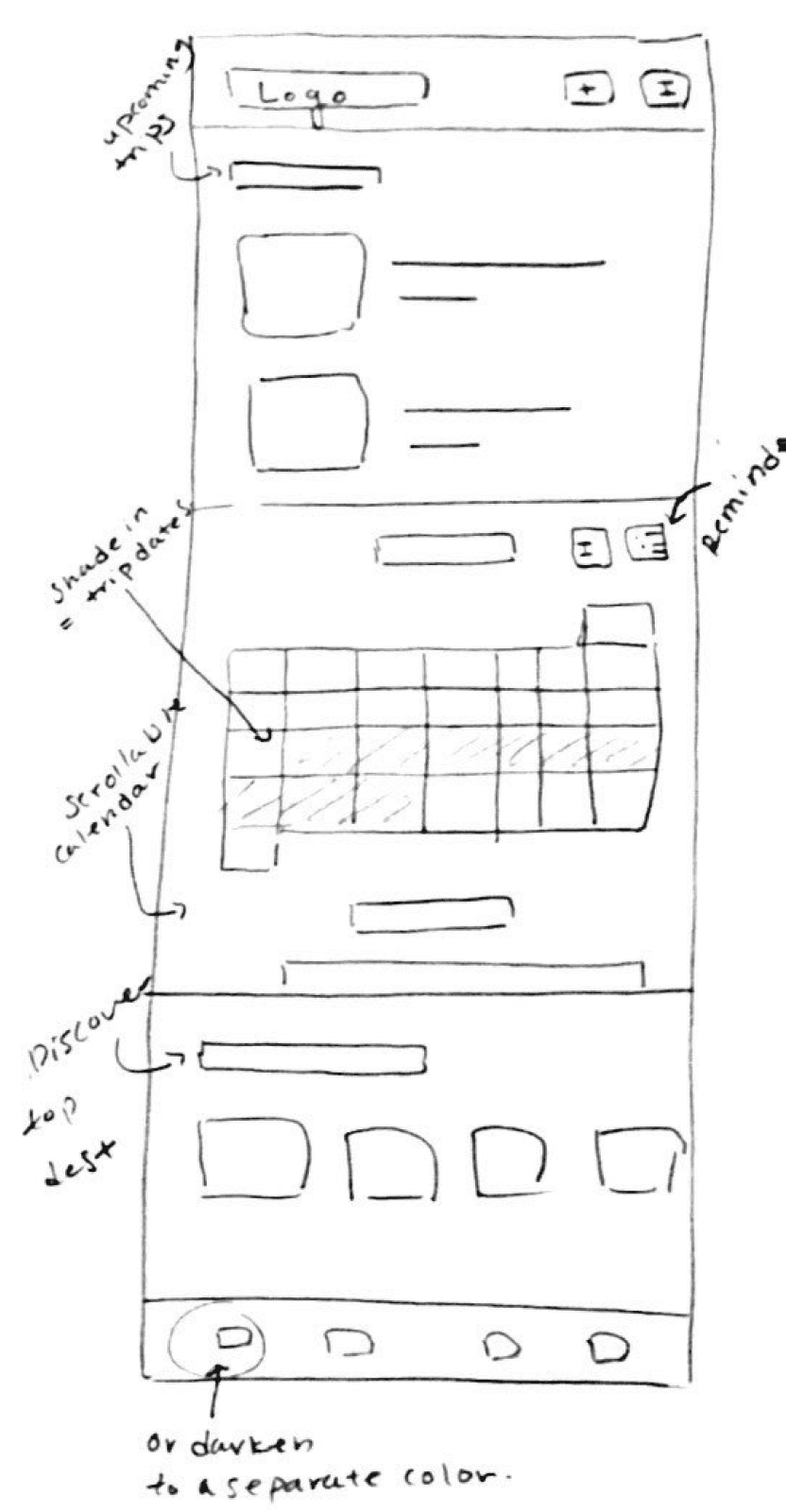
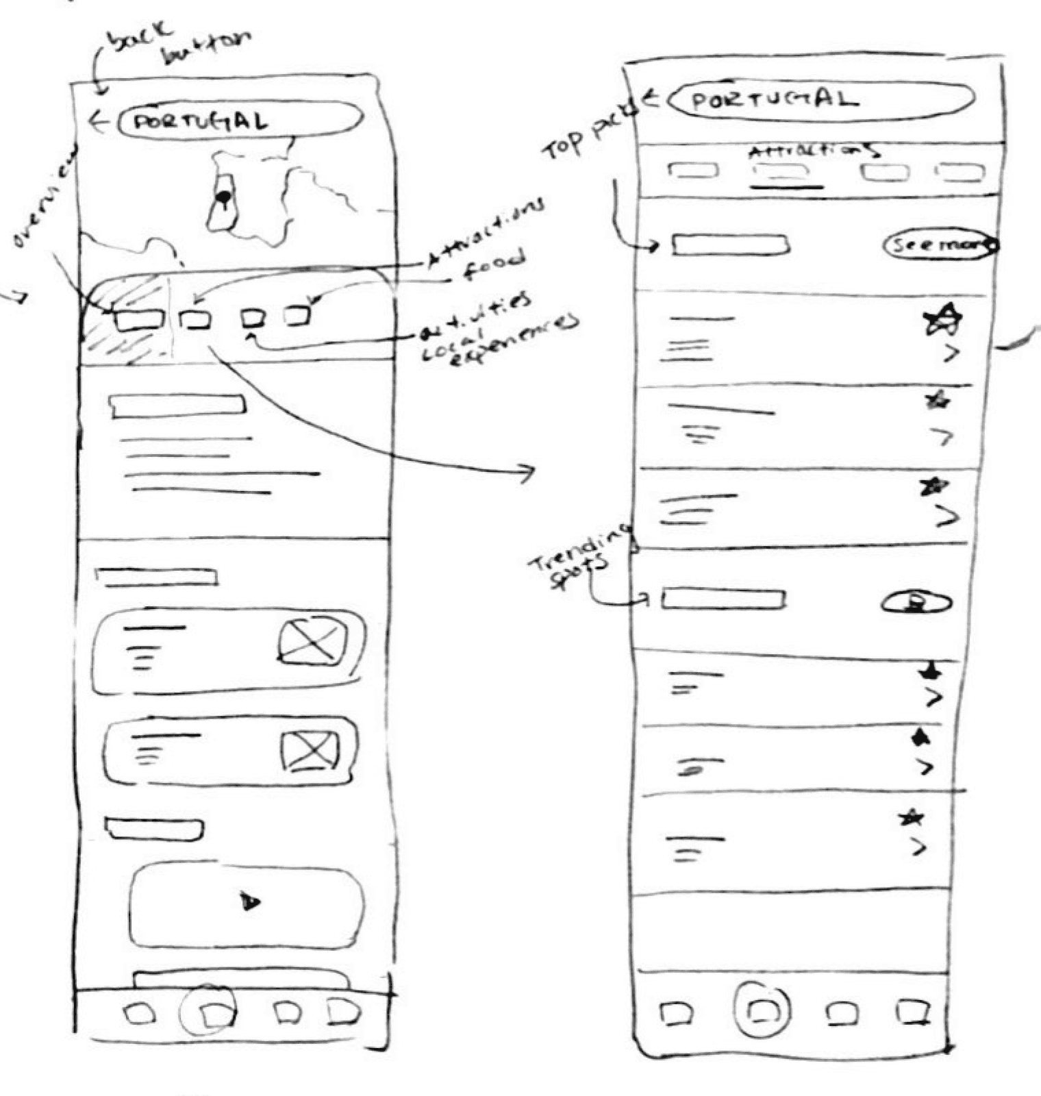
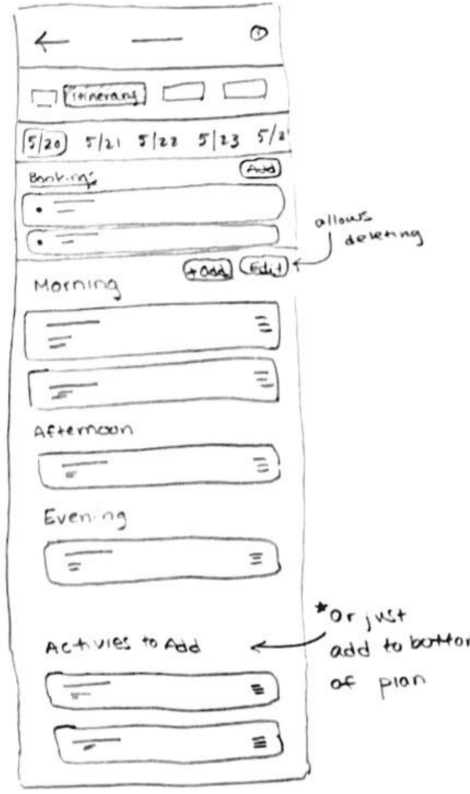
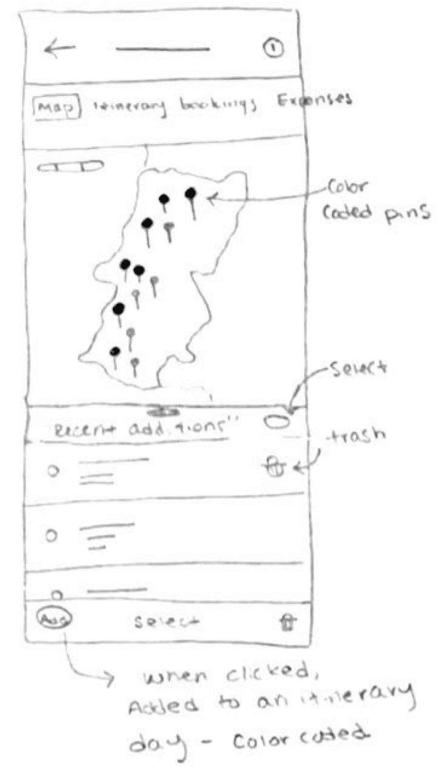
Low-fidelity Wireframes
I began by sketching out multiple drafts of key pages of my project. Here are some of the key screens and flows that I previously determined which I would then transition to my mid-fidelity wireframes:
Homepage
Discover - Search Destination
Itinerary
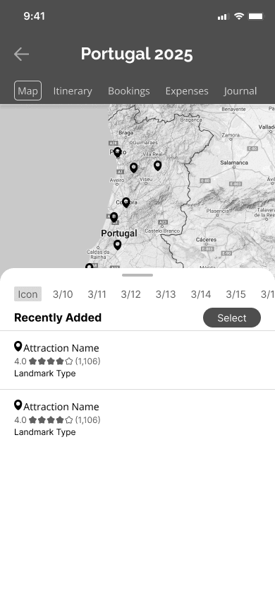
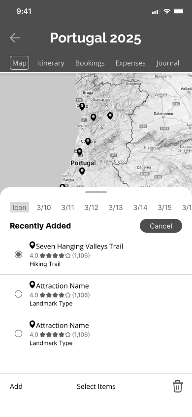
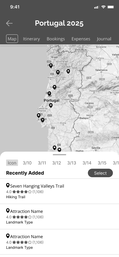
Map
Moving an Activity to a Date
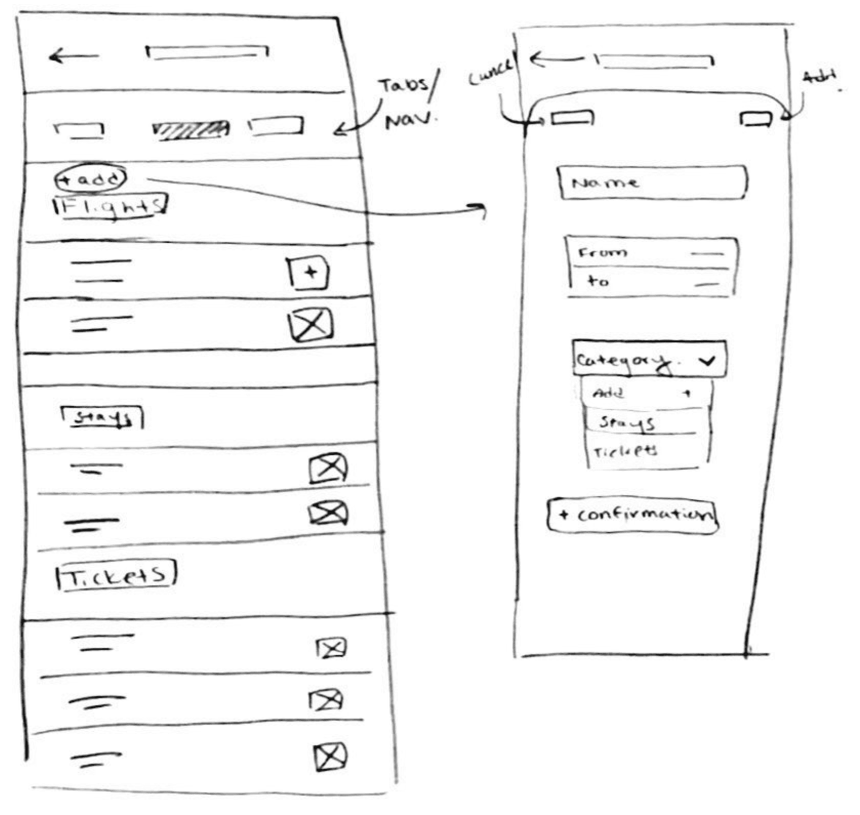
My Trip - Bookings
Mid-fidelity Wireframes
My low-fidelity wireframes allowed me to brainstorm a variety of designs for each page, and choose ones that I thought best aligned with the purposes of each page. I proceeded to create mid-fidelity wireframes of key pages and the pages for each task flow to hold usability tests with.
Here are some of the key pages I created:
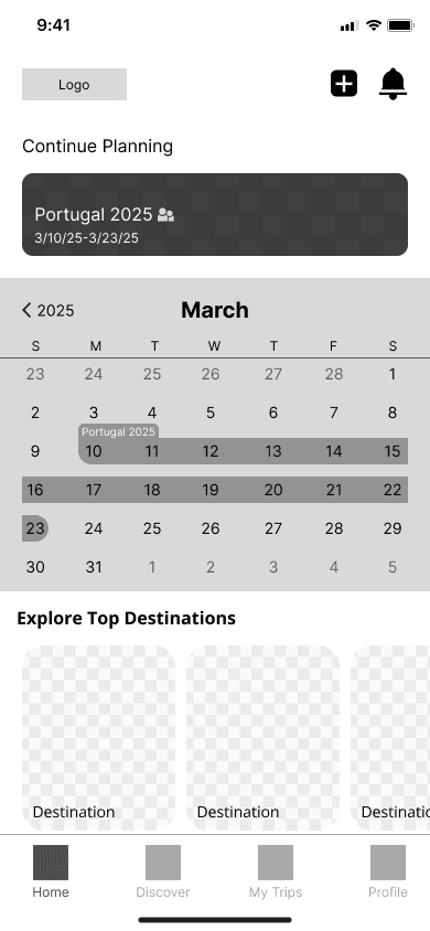
Homepage
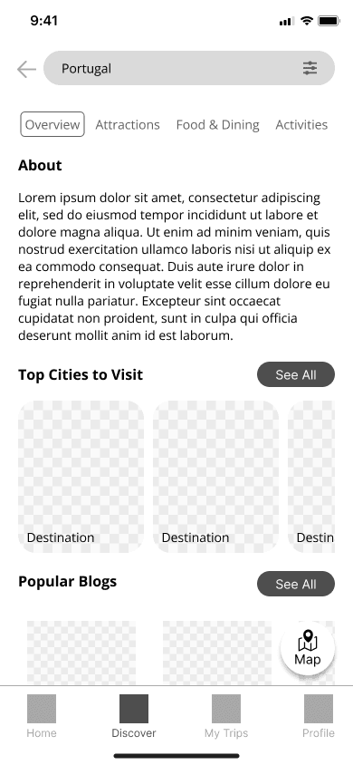
Discover
Map
Bookings
My Profile
Mid-Fidelity Usability Testing
To ensure a seamless experience, mid-fidelity usability tests were performed between 5 participants on the desktop pages. Participants were asked to perform 4 tasks:
Task 1: Search for things to do in Portugal, and add an attraction to your trip plan.
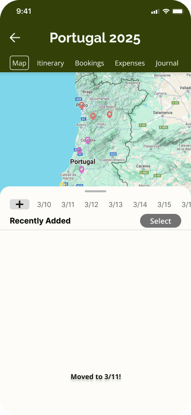
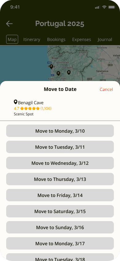
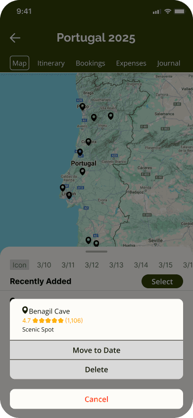
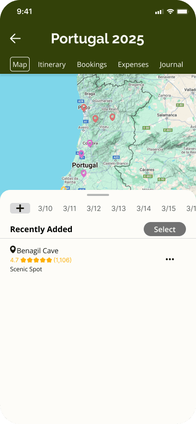
Task 2: Find the added attraction in your Portugal trip plan, move the attraction pin to March 11th, and then view your plan for that date.
Task 3: You have just booked your return flight, add the booking information onto the app.
Task 4: Upload a picture of your passport to your profile in the app.
Success was measured by the ease of navigation through the app, the ability to complete the task, the time it took to complete the tasks, the amount of clicks that strayed from the task flow and the intuitive uses of icons and buttons.
Mid-fidelity Usability Test Results:
The results of the test were quite consistent with all 5 participants finding the navigation within the app to be intuitive and straightforward, and completing the first, third, and fourth tasks easily.
There was confusion in the second task of organizing attractions on the map page by date. Some participants struggled to find the correct buttons while others did not find button names to be intuitive.
Iterations
Below are the highlights of some of the important iterations that were made based on the results of the mid-fidelity usability tests:
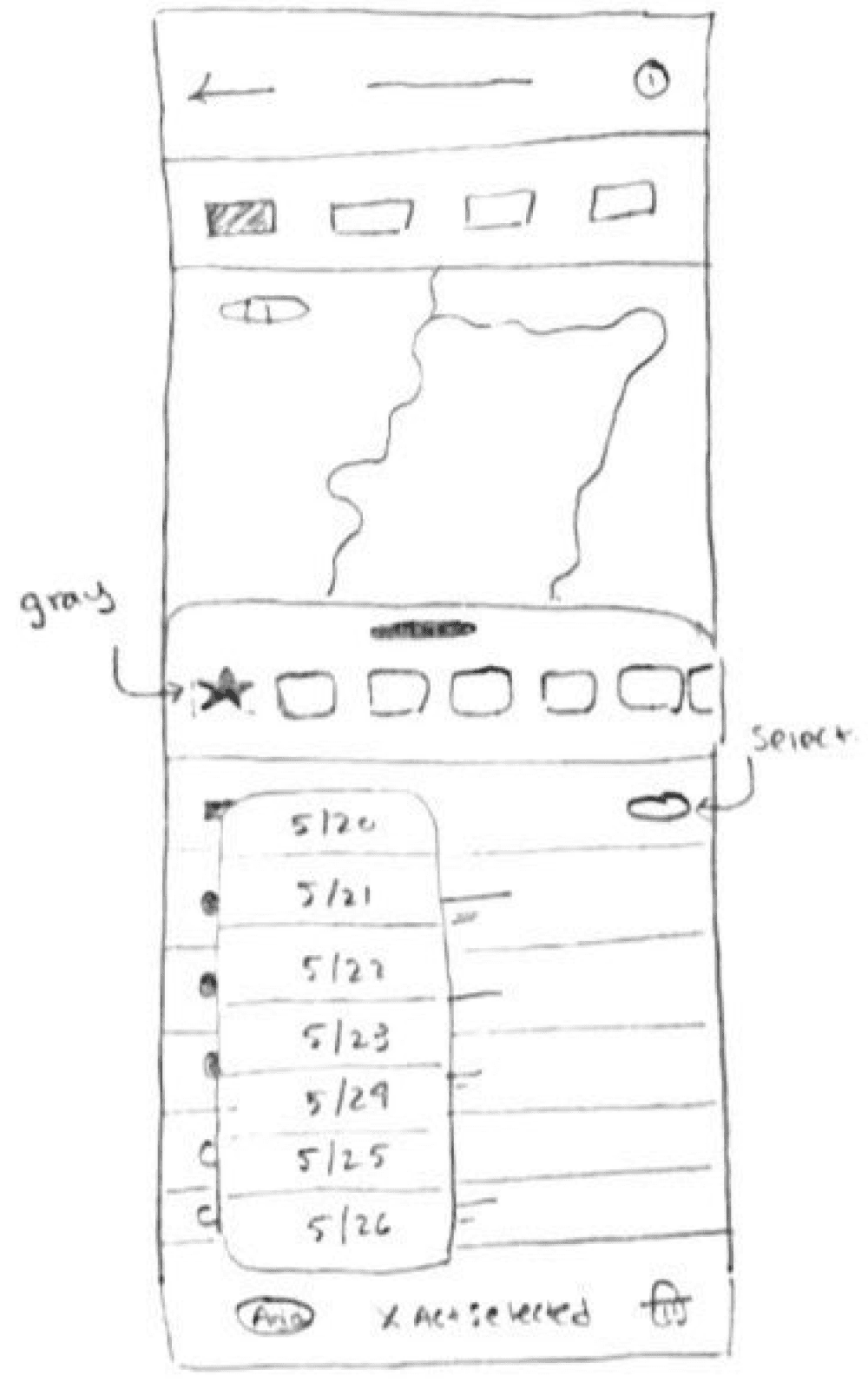
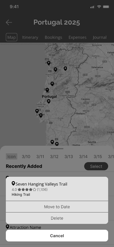
Selecting a Saved Attraction

Feedback from Usability Tests
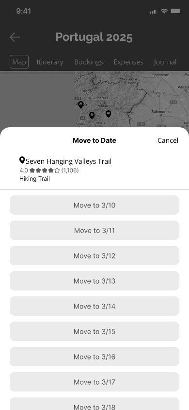
“Add” button changed to “Move to date” for a easier understanding of action.
Moving a Saved Attraction to a Date

Feedback from Usability Tests
Icon button added so that users could interact with individual attractions.
Additional flow was created separate to previous “select all” flow.
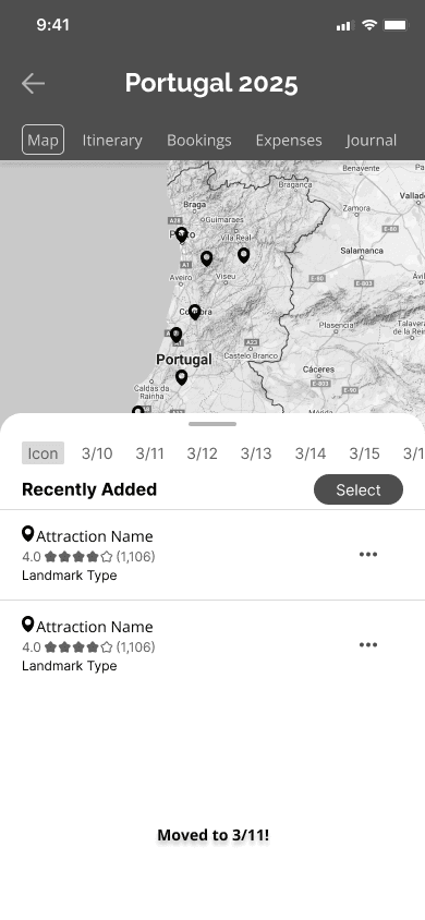
Giving Feedback to Users
Feedback from Usability Tests
Feedback added after the completion of the task to notify users that the completed the task was successfully.
Branding and Styling
I began my branding by choosing 5 brand values that I wanted users to feel while using the app:
Simplicity | Exploration | Enjoyment | Guidance | Inspiration
Because travel planning is often stressful, I wanted the branding to represent enjoyment and use simple styles to increase the usability and accessibility of the app.
Travel Planner
To ensure consistency across the app, I created a visual system that I could reference throughout my high-fidelity wireframes. Initially, I created two visual systems that differed in color palette. One favored blues as the primary colors, while the other with greens. I ultimately chose the color palette of warm greens and browns because they were easy on the eyes for long periods of time and made users feel relaxed and happy. In addition, the color palette is associated well with nature, travel, adventure, and my brand values.
Color Palette Final Selection
Primary Colors
#55500B
#C8BF7B
#DBBEA3
Secondary Colors
#9B5417
#7B7549
Neutral Colors
#191606
#4E4E4E
#AFAFAF
#D9D9D9
#FDFCF8
Alternative Color Palette
Primary Colors
#124C8A
#549FE9
#CDE1F4
Secondary Color
#C87B29
Neutral Colors
#06121E
#F7F9FB
Typography
Raleway Bold, 28px
H1
Open Sans Bold, 18px
H2
Open Sans Bold, 16px
H3
Open Sans SemiBold, 15px
Buttons/CTA
Open Sans, 14px
Body 1
Open Sans, 12px
Body 2
Adventerra Icon Library
Main Navigation
Home
Discover
My Trips
Profile
Home
Discover
My Trips
Profile
Map Pins
Buttons
Plus 1
Plus 2
Recent Pins
Back
Delete
Map
Lock
Unlock
Settings
Search
Filter
Profile Edit
High-Fidelity Wireframes and Usability Test
Wireframes
Using my branding and visual system, I transitioned my mid-fidelity wireframes into high-fidelity desktop wireframes, ensuring consistency of typography and color styles before conducting a second round of usability tests.
Homepage
Discover
Map
Bookings
My Profile
High-Fidelity Usability Testing
To ensure visibility and legibility of the page stylings, high-fidelity usability tests for my desktop wireframes were conducted with 4 participants who were asked to perform the same 4 tasks as in the mid-fidelity usability tests:
Success was measured by the same metrics as the mid-fidelity usability tests as well.
Test Results
Compared to my mid-fidelity usability tests, all 4 participants completed most of the tasks with little to no problems.
However, there was some confusion among 2 participants on using the “Discover” page for the first task. One participant noted that they would have preferred if the term was changed to “Search” as they didn’t think “Discover” was intuitive enough when looking for a specific attraction. However, I believe this had to do with the wording of the task, which I had changed during this test. To validate this hypothesis, I conducted the usability test with two additional participants with more clarified wording, and as expected, they completed the task with ease.
Iterations
Below are some of the highlights of the iterations I made on my high-fidelity wireframes based on the results of usability test.
“Discover” Page
Feedback from Usability Tests
Users wanted to be able to explore more options for each category in the “Discover” page.
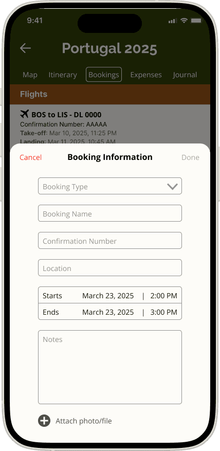
Adding a New Booking
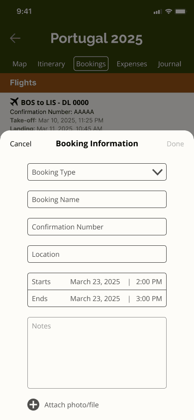
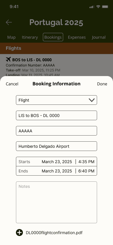
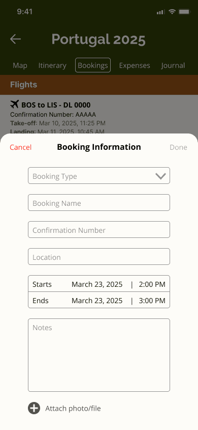
Feedback from Usability Tests
The “Cancel” and “Done” buttons were too similar to each other in style
The colors of unfilled text boxes were too dark and some users did not realize they were prompts instead of user input text
Moving a Saved Attraction to a Date
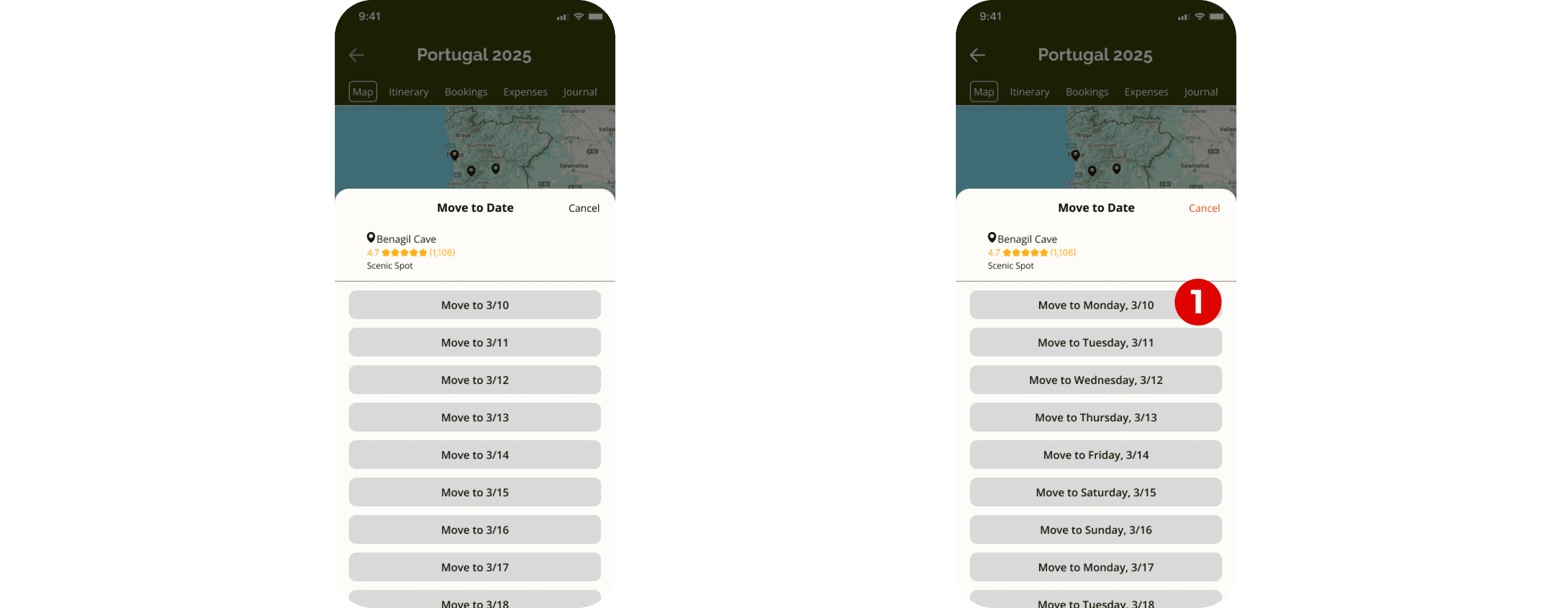
Feedback from Usability Tests
Days of the week were added to dates to help users recognize the dates they wanted to add attractions to
Reflection
Designing Adventerra was a rewarding experience that pushed me to deeply consider the needs of today’s travelers. From the initial user research to the final prototype, I focused on creating an intuitive experience that helps users plan, organize, and enjoy their trips with ease.
One of the key challenges I encountered throughout this project was balancing functionality with simplicity—ensuring users could access features such as destination discovery, itinerary creation, and bookings tracking without feeling overwhelmed.
However, through usability testing, I was able to refine features, improve the overall flow, and strengthen my skills in user-centered design. It reminded me that great design is not just about aesthetics but about solving real problems in meaningful ways.
Next Steps
Optimize data collection and user tracking - Developing systems to track and collect data from users for further improvements.
Add AI features - Including AI features to ensure the app is personalized to each user’s interests.
Expanding/improving accessibility - Using user feedback to create features and make UI changes that can improve accessibility for a wider audience.
New feature planning - Conducting surveys and receiving feedback from users to explore the possibilities of new features such as a travel journal, notifications for expiring travel documents, collaborative trip planning, and packing lists.