
Responsive Website Redesign | 140 hours | Solo Designer
User Research
Information Architecture
UX/UI Design
Responsive Design
The Greater Boston Chinese Cultural Association (GBCCA) has been dedicated to promoting public awareness of Chinese culture and heritage in the Greater Boston communities for almost 70 years. To maximize the organization’s outreach, an intuitive website with a clear and organized sitemap is necessary to appeal to today’s modern website user.
Intuitive Navigation
To improve the site navigation and make information more easily accessible to site users.
Responsive Design
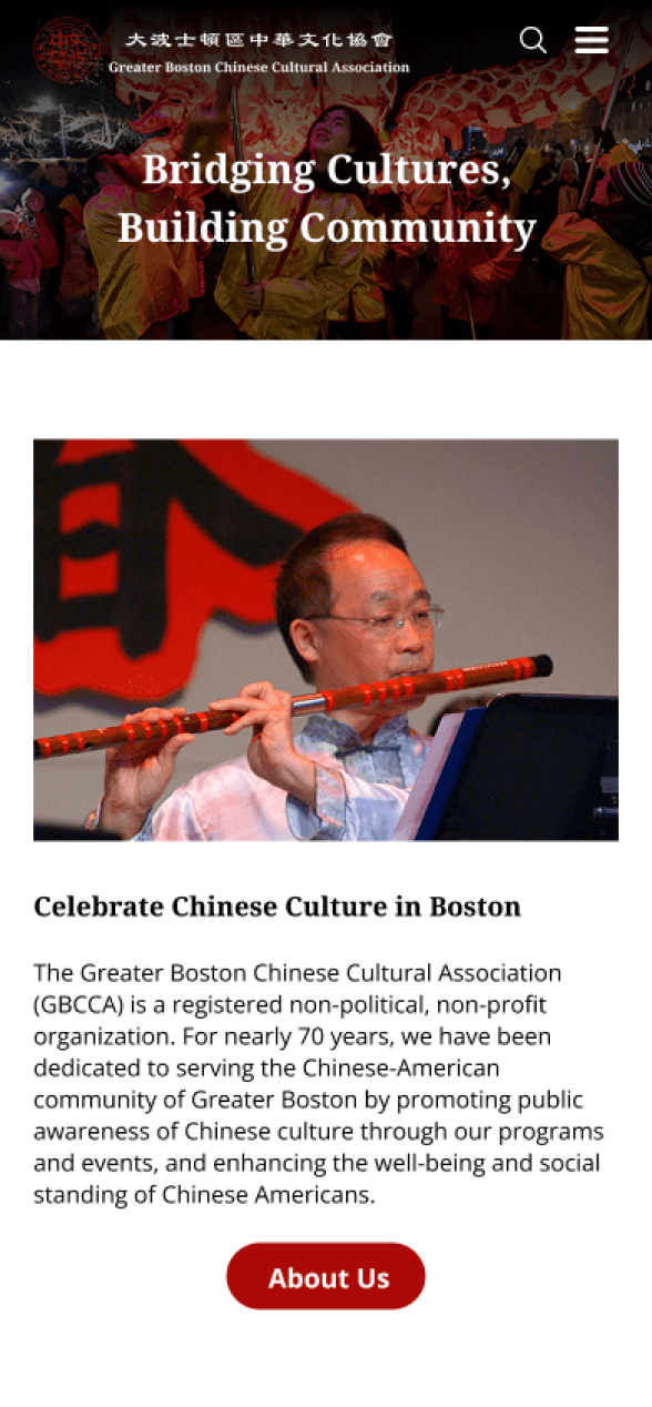
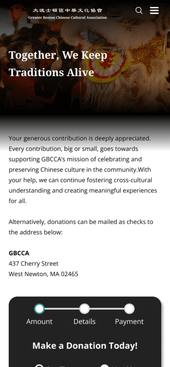
To create a responsive design, ensuring adaptability across differently sized screens
Outstanding CTAs
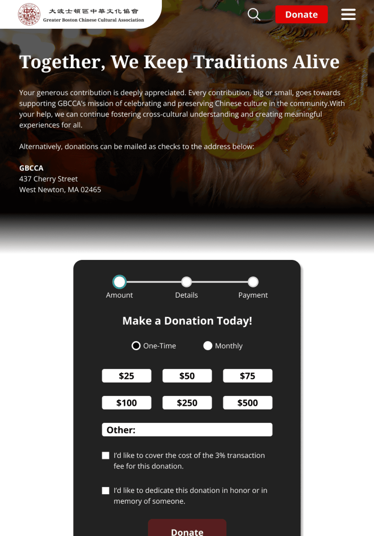
To clarify website CTAs such as making a donation and applying for volunteer positions/opportunities.
Updated UI
To update the UI and better appeal to the modern website user, encouraging website use.
Problem Statement
The current GBCCA website faces multiple challenges that negatively impact the accessibility, functionality, and overall user experience. Such challenges include an outdated UI, confusing and inconsistent sitemap, low-resolution images, unclear CTAs, and incomplete/uninformative descriptions of the organization’s main purposes.
A website redesign is necessary to garner new engagement on the organization’s website, improve users’ access to resources, and inspire them to participate in the organization’s events and programs.
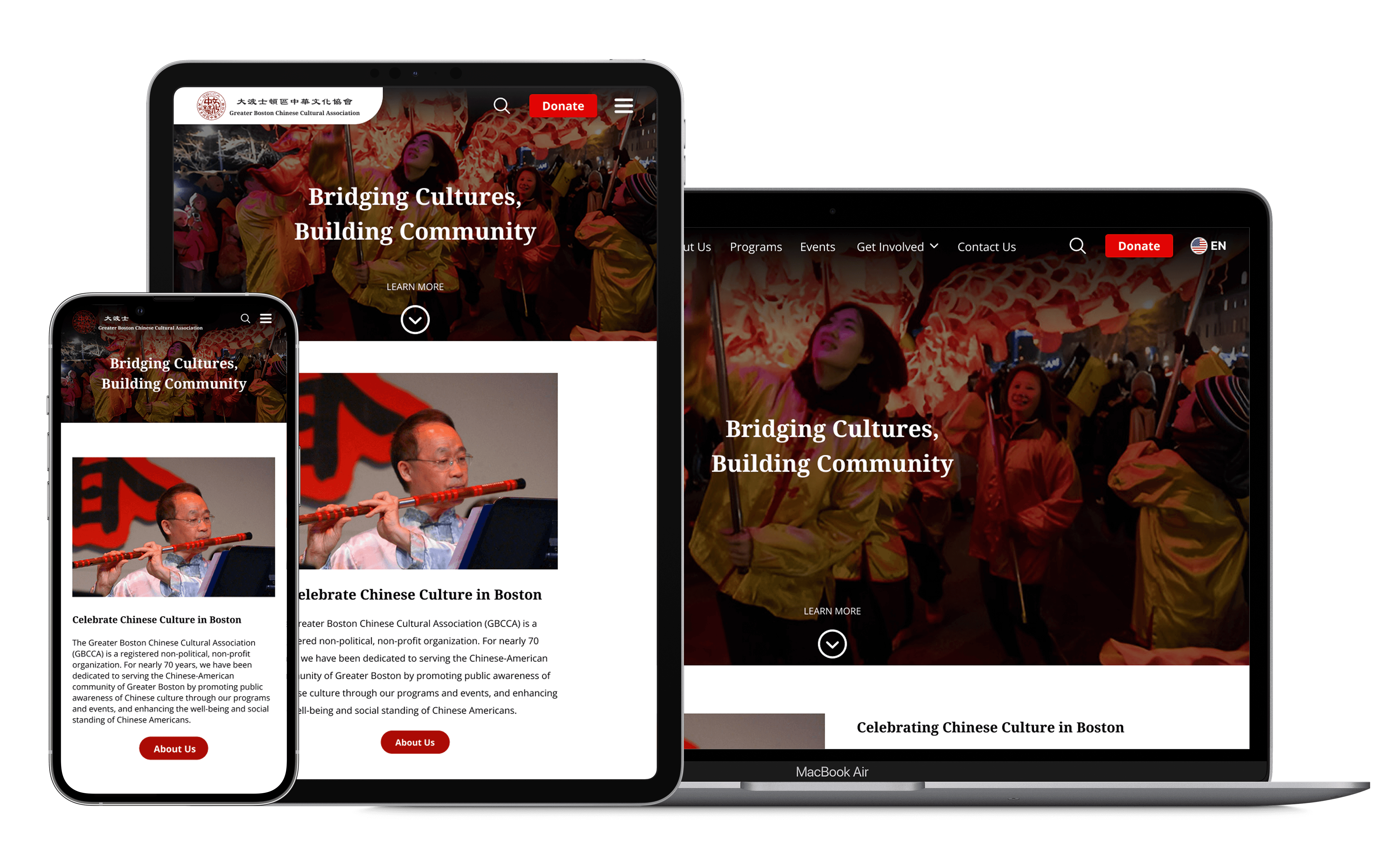
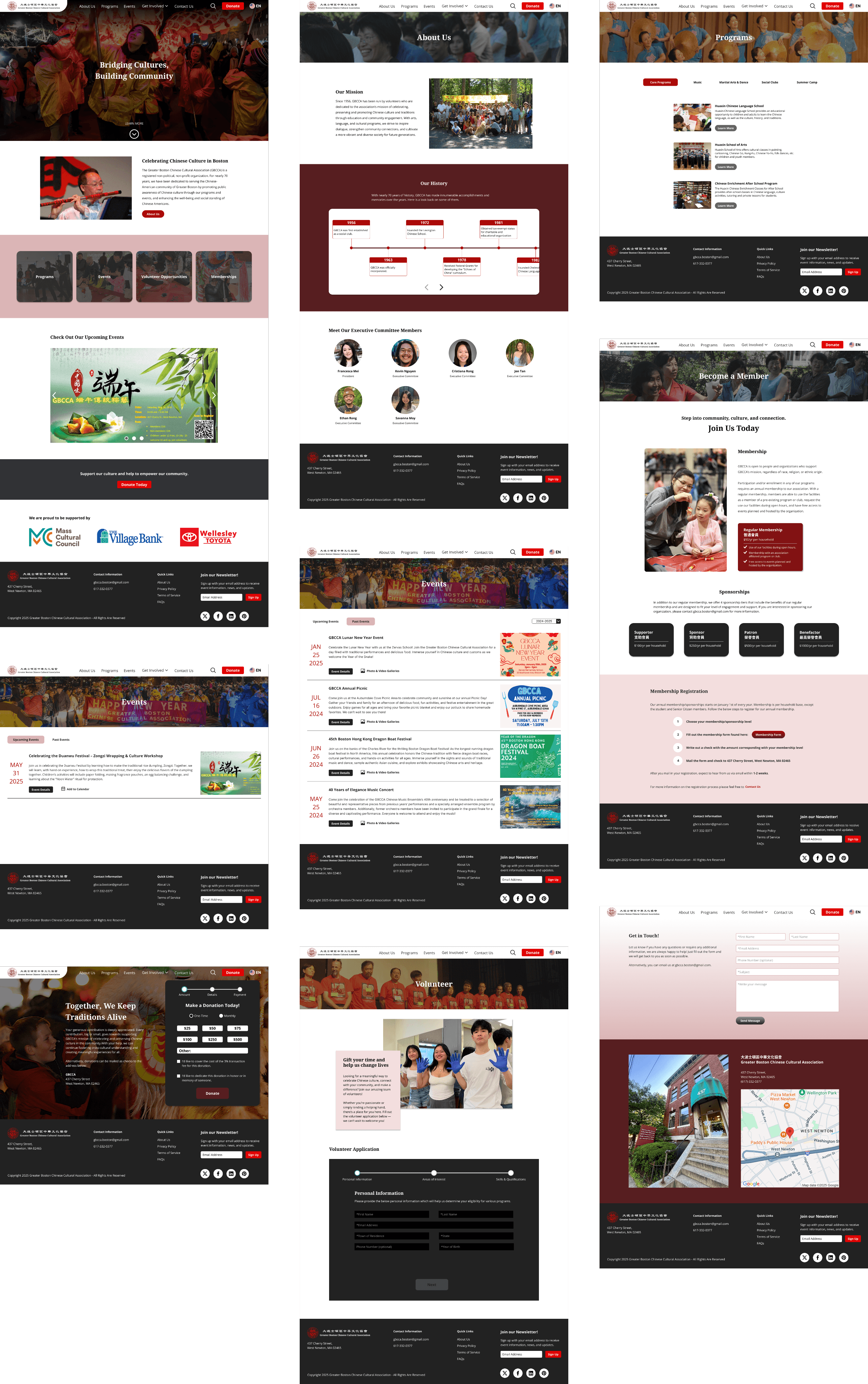
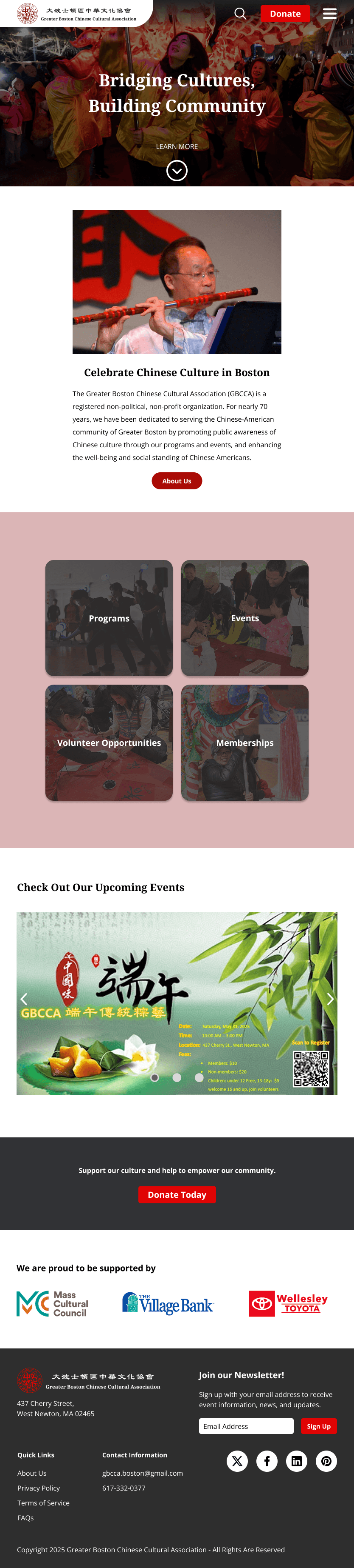
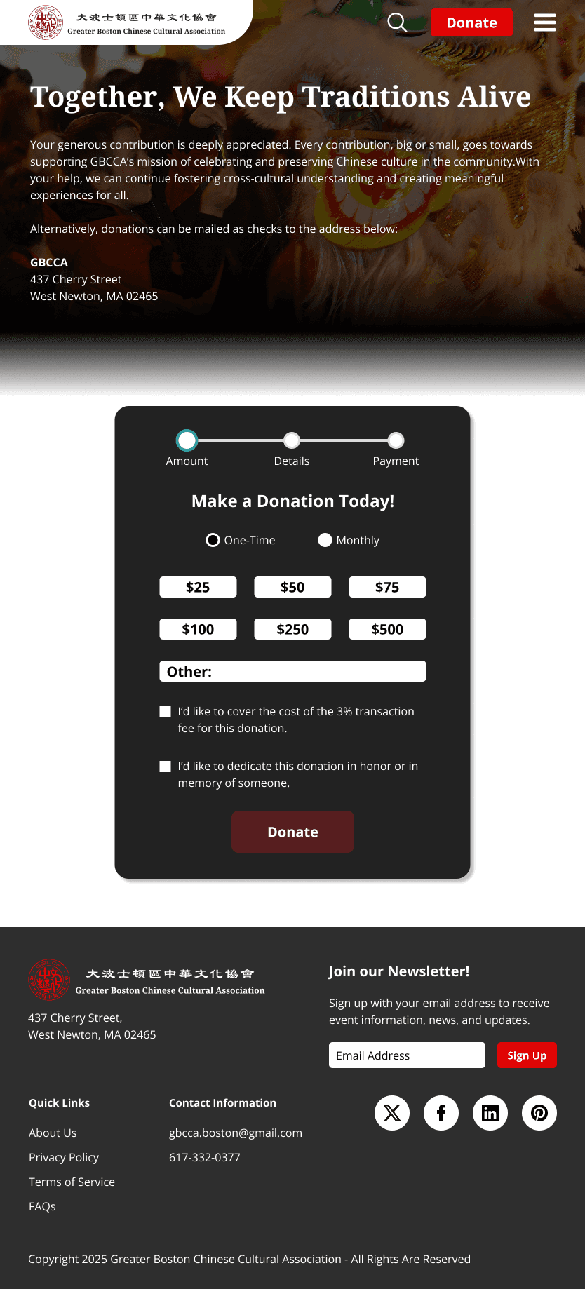
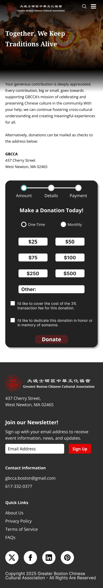
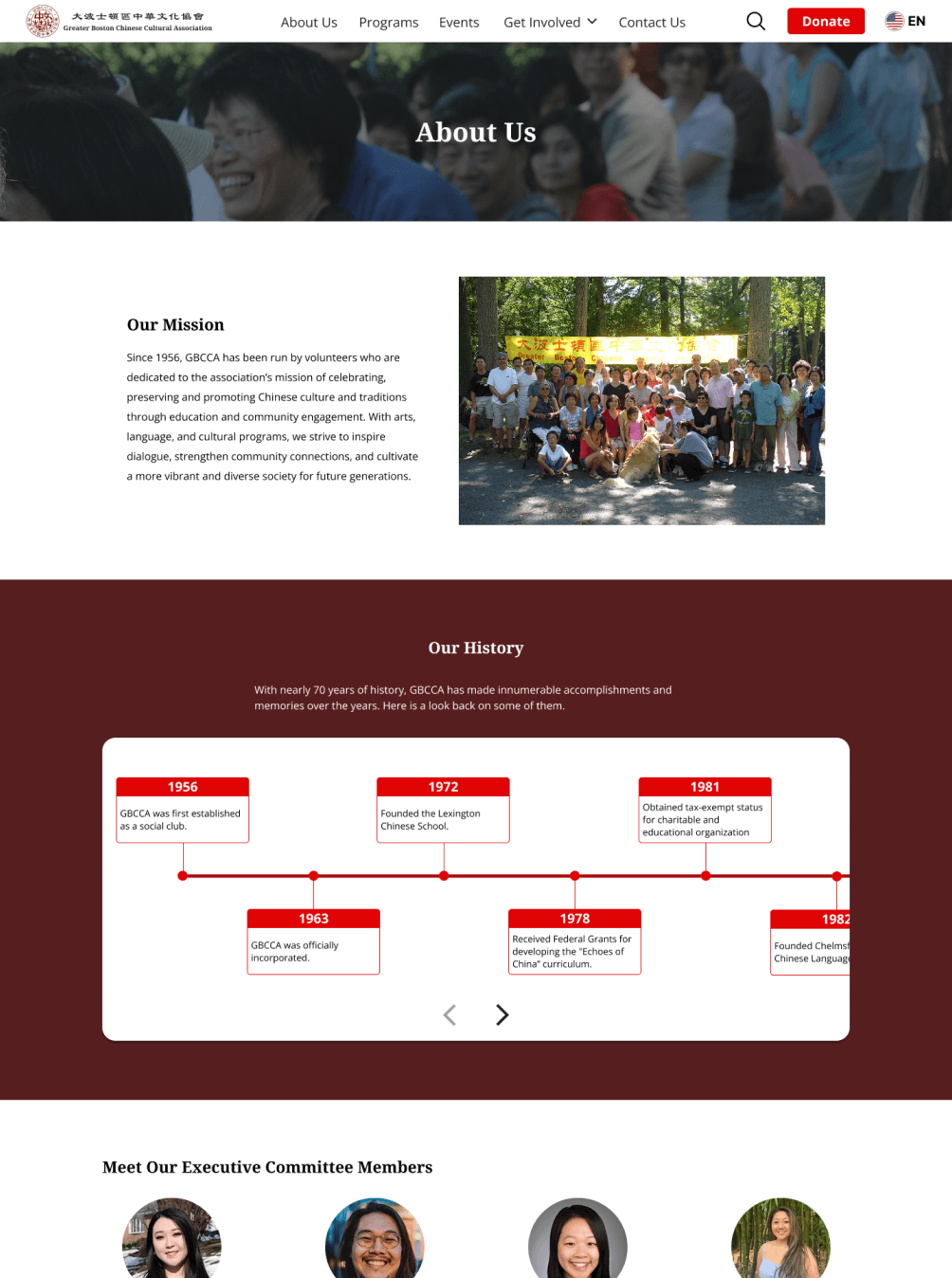
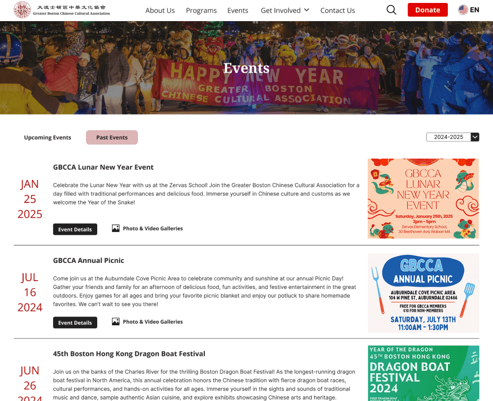
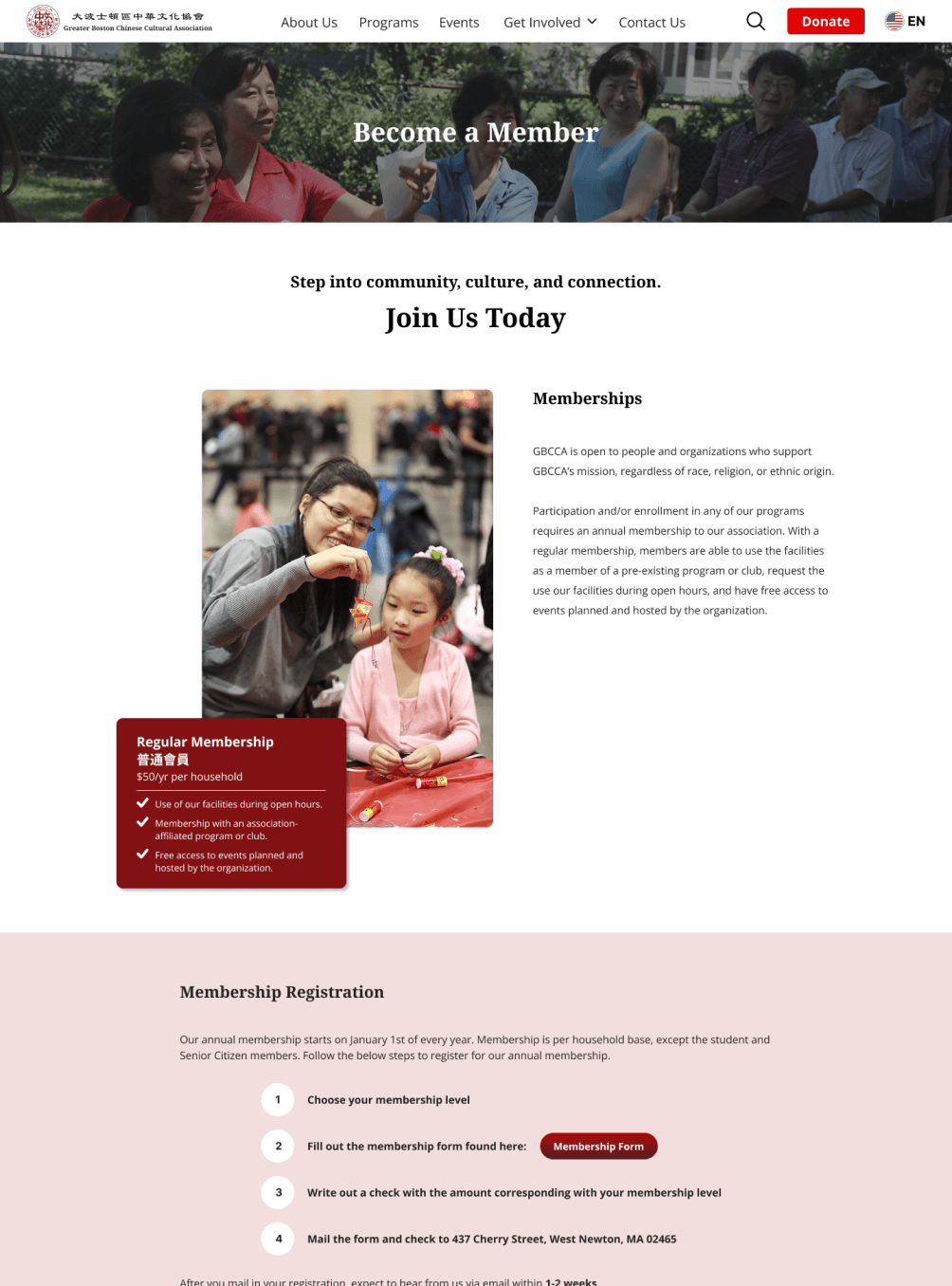
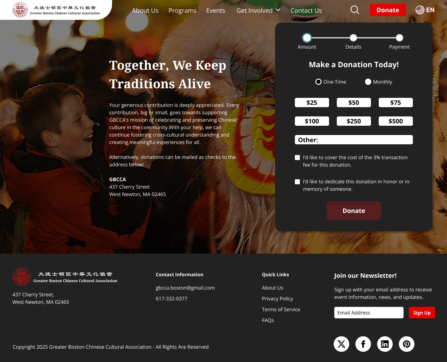
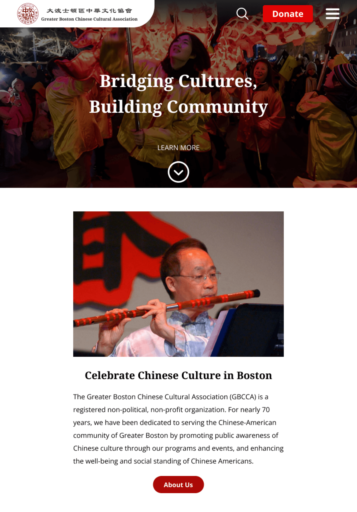
Final Product
The final GBCCA website redesign provides an engaging experience with intuitive navigation, improved accessibility, and clear CTAs to encourage users to explore the site and get involved with the organization.
Desktop Wireframes
Tablet Wireframes
Mobile Wireframes

Research Objective
My goal for this project was to discover what information users look for when searching for a cultural organization to join and how users think the website could be improved upon so that I can redesign the GBCCA website to appeal more to users and encourage them to join in a cultural organization or their events.
Research Methods
Competitive Research
To understand the market landscape of existing Chinese cultural organizations, I researched 3 competitive organizations in the Greater Boston Area and used a SWOT analysis to assess their strengths, weaknesses, threats, and opportunities for improvement.
Strengths
Weaknesses & Opportunities
Threats
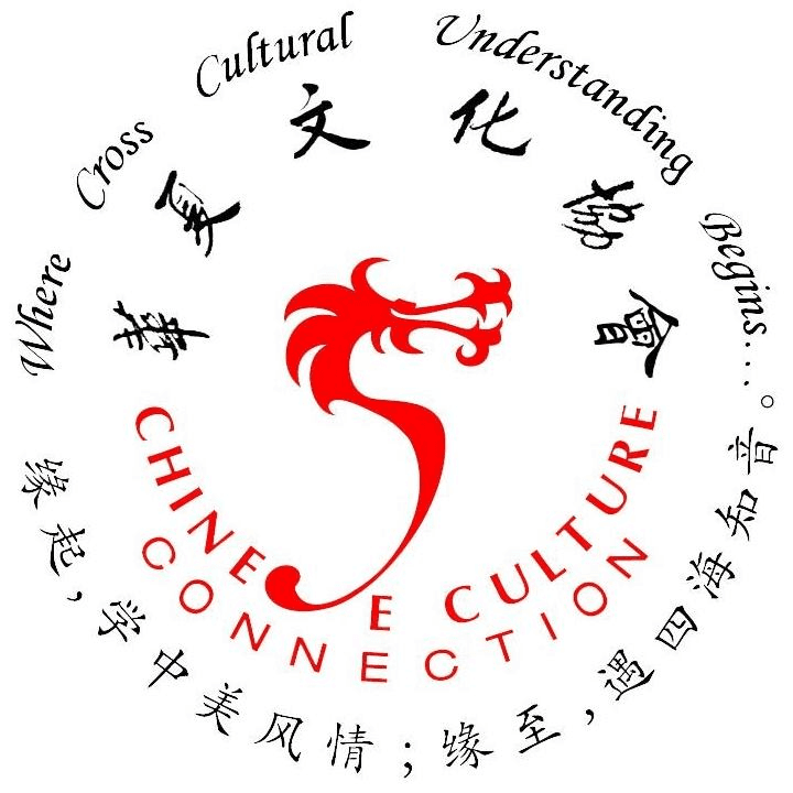
Chinese
Culture Connection
華夏文化協會
Passionate and proactive members
Community involvement goes beyond cultural events to assisting young professionals and seniors
Authenticity with a state program
Insufficient information on the benefits of a membership to the organization
Heavily reliant on the community for fundraising
Focuses on child education; may be losing opportunities to appeal to a wider audience
Current economic conditions may prevent donators from donating as much and the nonprofit may struggle without sufficient funds

Chinatown
Main Street
華埠主街
Good reputation for involvement and support for local businesses and humanitarian missions
Government support for the organization and its mission
Provides volunteer opportunities
Insufficient information on why they need donations and what action they want website users to take
Could do more to promote and support local businesses/tourism on their website
Not much information on the organization’s community involvement and cultural events
Government owned land might require permits for changes to the landscape
Hard to keep up with quick business turnaround due to economic conditions
Chinese American
Assoc. of Lexington
莱克星顿华人协会
Proactive in town & school events.
Support from town officials
Long-standing reputation among Chinese-Americans in the town
Involvement in other town issues aside from education
Website is very text heavy and not user-friendly.
Confusing side navigation bar.
Website doesn't seem to show inclusivity for people looking to share Chinese culture and heritage.
Insufficient information and CTA buttons
Competitor organization in the same town may cause loss of membership/participation
Possible existence of government restrictions on registered nonprofits
User Interviews
With my competitive research findings, I was able to determine the topics of discussion for my user interviews and conducted them with 5 participants who had prior experience with community events and/or as a member of a nonprofit organization.
I first gathered demographic information from interview participants (age, ethnicity and location) to gain insights into any correlations between demographics and the different needs of users.
I then asked a series of questions regarding participant’s involvement with events and organizations to learn about their motivations and needs for doing so.
Lastly, I conducted a website audit of the original GBCCA website, asking users to completed a series of tasks, then going through various pages on the website to gain insights on how users thought the site could be improved.
Here are some of the key interview questions and site audit tasks I asked during the user interviews:
Demographic Information
Age
Ethnicity
City of the organization you were a part of
Involvement with Community Events/Organizations
What motivated you to join a community group and/or event?
What are the ways that you learn about community events?
What do you think would motivate you to make a donation?
What are the main purposes you would have for visiting a website for a nonprofit?
Website Audit Tasks
Please show how you would learn about an upcoming event.
Please sign up to be a member of the organization.
Please show how you would sign up for Mandarin language on the website.
How would you make a donation through the website?
Website Audit Questions
How easy is it to find information on this website?
Are there any specific sections or content you think should be more prominent on the website?
How important is it for you to be able to get involved through the site?
If you had more time to explore the website, what kind of content would you want to see more of?
Through conducting the research interviews, I was able to gain insights into the main motivations and needs of participants in community events and organizations.
Information Consolidation
Affinity Map
With the information from my user interviews, I created an affinity map to group important insights and determine common desires for site improvements. Here are some of the key insights I gathered from my research findings:
The general site navigation and the use of the navigation bar need to be improved and made more intuitive.
Key call-to-actions are difficult to find and need to be made more visible across pages on the site.
There is insufficient information on the membership tiers and what the benefits of a membership are.
Information about the organization’s mission and its leadership team is needed to ensure the credibility of the organization.
The addition of more and higher-quality images is needed to appeal better to users and increase usability throughout the site.
User Personas
Based on my research findings, I created 3 user personas that reflected the goals, challenges, and needs of key audiences.
Persona 1
An energetic software engineer who has connections with other GBCCA members. He is passionate about the organization’s mission and tries to get involved as much as he can due to not being able to commit to an annual membership with his busy work schedule.
Persona 2
A young art teacher who has just moved to the Greater Boston area and is searching for a community where she can embrace her Chinese heritage and socialize with people in a new city. Her shy personality makes it difficult for her to easily trust and join unfamiliar organizations.
Persona 3
A working mother of 2 young kids looking for a community that can help provide after-school care and involve her kids in Chinese language and culture classes. She struggles to find time as a working mother and needs to be able to find an organization that suits her needs quickly.
Throughout the rest of the project, these personas would be used as references to make key design decisions based on real-life needs and expectations.
Adam Zhao
Age: 28
Job Title: Software Engineer
Status: Single
Location: Boston, Massachusetts
Character: The Caregiver
Compassionate
Easygoing
Honest
Energetic
Influencers


Motivations
Feels motivated to help seeing the work and efforts other members of the organization make
Passion towards the organization’s mission of promoting Chinese culture within the local community
"I love supporting my community and friends knowing all the hard work they put into their passions and am always looking for more opportunities to do so."
Biography
Adam Zhao is a 28-year-old software engineer who loves meeting new people and finding different activities to take part in. After learning about the GBCCA community from a friend, he’s become a frequent attendee of their events and made valuable connections with other members of the organization. Although he would love to be more involved with the organization, his current job and commitments have made it difficult for him to do so. Instead, he goes to as many events as he can so that he can support his friends who are involved both as organizers and as performers for the events. In addition, he has often thought about making donations to some of the individual programs within the organization to further his support but has found it too difficult to do so with the current methods in which the organization receives donations.
Goals
To support the organization by going to as many events as he can
To support the organization more through making donations
To make more connections with other members of the community
To help the community grow by spreading further awareness of the organization and promoting it within his own network
Pain Points
Feels bad about not being able to volunteer as much as he would like
Struggles to find an easy and streamline way to make a donation
Does not know how to help promote the organization and upcoming events
Cannot read Chinese and struggles to read certain pages on the website
Needs
To be notified of upcoming events
An easy and streamline way to make donations
To have an easy way to help promote the organization and their upcoming events
A website that is accessible for someone who doesn’t read Chinese
To find other ways that he can get involved with the limited time and schedule he has
Sophia Sun

Age: 23
Job Title: Art Teacher
Status: Single
Location: Newton, Massachusetts
Character: The Innocent
Optimistic
Considerate
Sweet
Introvert
Influencers


Motivations
Absence of friends and network as a new resident in the city
Desire to help preserve Chinese culture and traditions in the US
"Moving to a new city is both extremely exciting and overwhelming at the same time. I hope to be able to find a community that will make Newton feel like my home away from home.”
Biography
Sophia Sun is a bright and motivated college graduate who just moved to Newton, Massachusetts after earning a Bachelor’s degree in art education and landing her first job as an art teacher for a local elementary school. As a Chinese American who grew up in the States, Sophia has always sought out ways in which she can embrace her Chinese heritage, and she has been looking for a local community that is both passionate and active in celebrating Chinese culture and traditions. However, as a new resident in an unfamiliar city, Sophia has concerns and hesitations about being able to find a supportive and safe community where she can comfortably socialize with others.
Goals
To find a local community to socialize with in a new city
To find people she can both relate to and celebrate her Chinese heritage with
To befriend a couple people through the organization and be able to bring them into her personal life.
To feel safe and comfortable as a member of an organization
Pain Points
Shy and introverted personality makes her hesitant to join an unfamiliar organization or events alone
Currently struggling to manage her time with finding a community to join while dealing with her recent move and new job
Struggling to find resources to help her search for new events/organizations to join
Needs
A safe community that is passionate towards their cause of spreading and preserving Chinese culture and language.
A website where the information is intuitive and easy to find
A website that provides information on upcoming events
A website that provides her with information on the leadership team
A website where she can sign up for newsletters and learn firsthand about upcoming events
Isabella Chen

Age: 36
Job Title: Dentist
Status: Married, 2 kids
Location: Newton, Massachusetts
Character: The Sage
Patient
Responsible
Dependable
Intelligent
Influencers


Motivations
Passion and dedication towards her career and job as a mother
Desire for her kids to connect with their cultural heritage and extended family
"It’s really important to me that my children are able to learn the Chinese language, culture and traditions to connect with their extended family and pass on to future generations.”
Biography
Isabella is a dentist with 2 daughters who attend elementary school. As parents of 2 young children with full-time jobs, she and her husband struggle with balancing their work schedule with their children’s school schedule and are looking for a community organization that will be able to provide them with after-school care. In addition, Isabella is also looking for an organization that can provide Mandarin classes and other classes in Chinese culture so that her children can learn and keep in touch with their Chinese heritage. With many Chinese organizations in the surrounding areas, she struggles to decide which one will be able to provide her kids with the best care and education, while carrying the same values that she and her husband have so that they have a reliable support system.
Goals
To have a supportive and reliable community for her family
For her daughters to be able to learn Mandarin Chinese
For her daughters to be involved with other aspects of Chinese culture
To find an after-school program that can help look after her kids while she is at work
Pain Points
Struggles to find time during her work hours to look after her kids after school
Doesn’t have time to teach her kids Mandarin by herself
Financial struggles with paying for childcare
Choosing the right programs based on location, price, and education
Struggles to choose a community that will support her family while holding the same values as she does
Needs
A supportive community that shares her values in spreading and preserving Chinese culture amongst the local community
A program that is close by and easy to drop off and pick her kids up from
A website where she can learn/check the backgrounds of the educators involved
A website where she can find information easily and quickly amidst her busy schedule
A website that provides information on membership benefits and fees
Design Ideation
Venn Diagram
The creation of a Venn Diagram of the project goals helped me to align the objectives of potential parties involved in the project which would later be a key deciding factor in determining what features my redesigned website would have.
POVs and HMWs
With my Venn Diagram and user persona in mind, I was able to determine a POV statement and 3 corresponding HMW questions that addressed actionable problems for me to explore within my design ideas:
POV Statement
I’d like to explore ways to redesign the sitemap and help users navigate easily through the website because the current users of the website are unable to find key information that they visit the site for.
HMW Questions
How might we help users navigate easily through the website and quickly find the information they are looking for?
How might we inspire prospective donors, members, event participants and volunteers to contribute to the organization both on and off the website?
How might we showcase how the organization is contributing to the local community and enriching their members’ lives?
Feature Set
Using the POV statement and HMW questions, I came up with a set of features and prioritized them into four categories based on their alignment with my user persona and Venn Diagram goals: (1) “Must-have”, (2) “Nice to have”, (3) “Surprising and delightful”, and (4) “Can come later”.
Here are some of the high-priority pages and features that I would later include in my website design.
Newsletter Subscription Form
A form that allows people to receive weekly/monthly newsletters from the organization on upcoming events and volunteer opportunities.
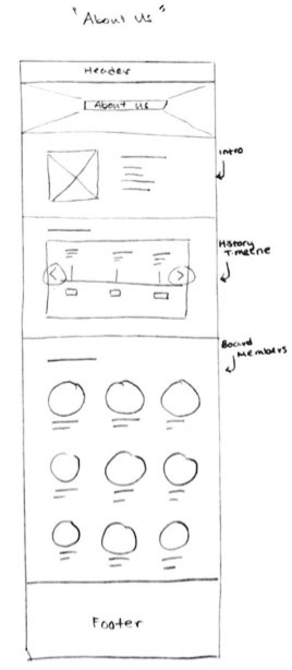
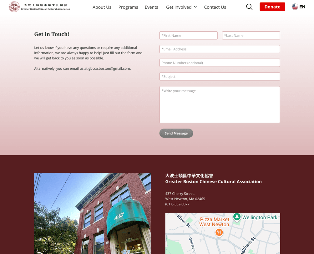
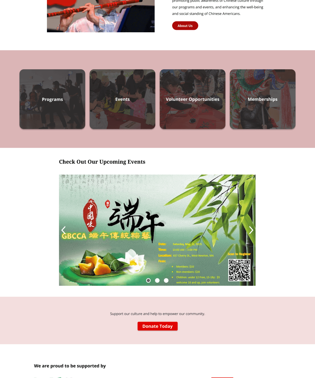
About Us Page
A page found in the navigation bar that introduces the organization's mission, history and current leadership team to website users.
Donation Button and Form
A easily found CTA button that navigated to a donation form through which users can make safe and secure donations.
Get Involved Navigation Button
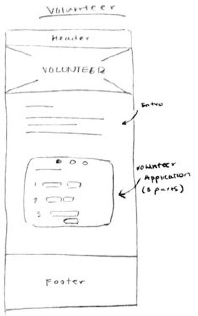
A button on the nav bar that leads to pages where people can get involved with the organization such as volunteering or becoming a member.
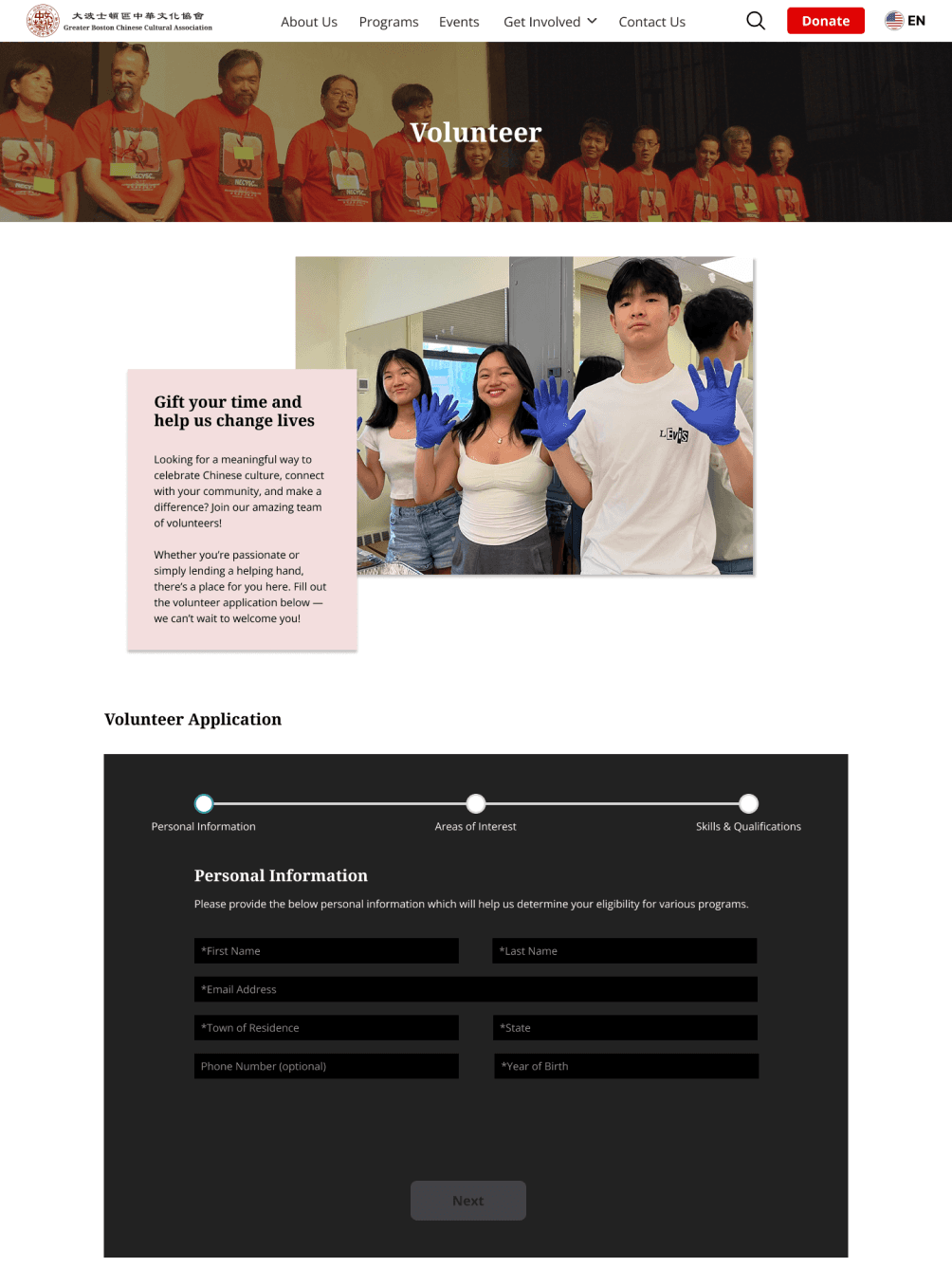
Volunteer Application
An application form found through the “Get Involved” button that allows users to apply for volunteer opportunities with the organization and its events.
Language Settings
A feature that allows users to view the website in both English and Chinese languages to increase accessibility to potential site users.
Information Architecture
Card-Sort Studies
In order to identify how users grouped content-related terms with pages on the website, I conducted a closed card-sort study with 4 participants. The results of this study would ultimately help ensure that my sitemap would be intuitive to users.
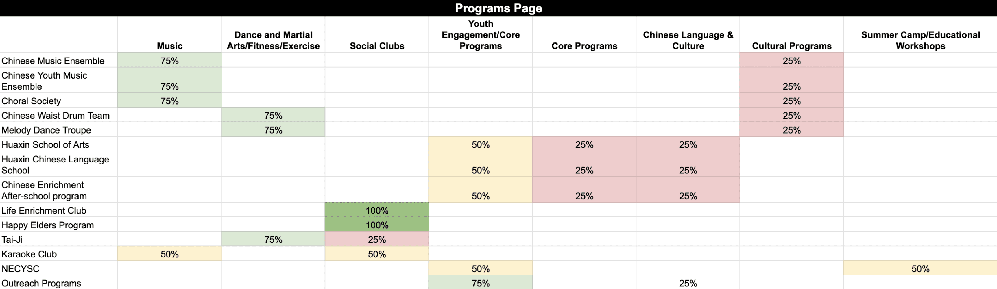
Along with the content-related card-sort, I also conducted an open card-sort to understand how users categorized the programs that the organization offers. I held this card-sort due high volume of programs available and the feedback I received from my user interviews where participants felt that categories for the programs would help users better process all the information on the page.
For most of the cards, it was obvious which pages each card belonged under. The only cards that seemed to have split opinions included the "Contact Us", "Social Media", "Location & Hours", "Partners & Sponsors", and "Subscribe to our newsletter" cards. This was because participants had either seen these topics placed on different pages of other websites before or because they thought they should have their own separate categories.
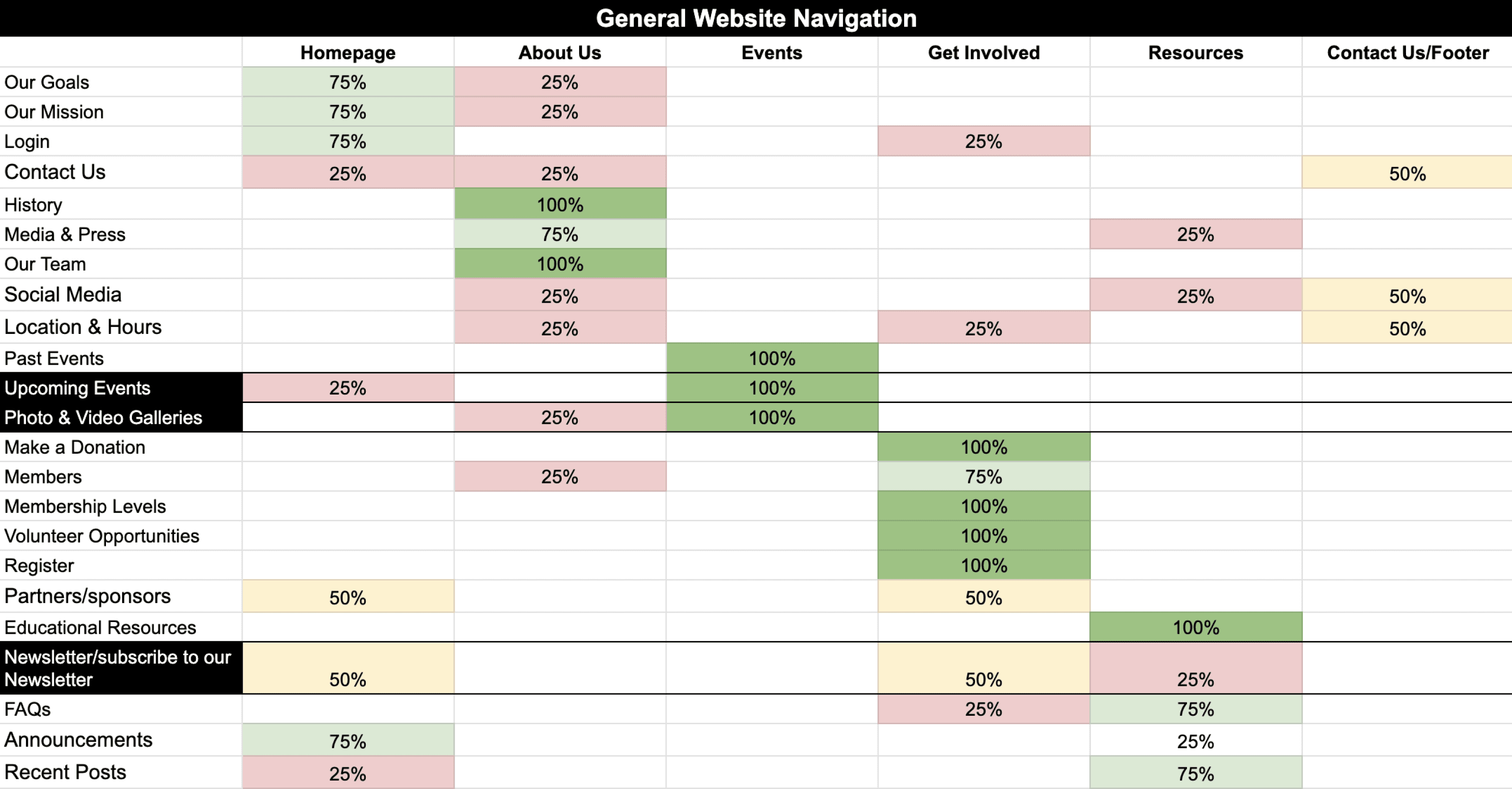
Although there were differences in category names due to the nature of an open card sort, the groupings of similar programs were apparent for most cards.
The "Karaoke Club" and "NECYSC summer camp” cards were split 50-50 between 2 categories, which validated the placement of cards in either category.
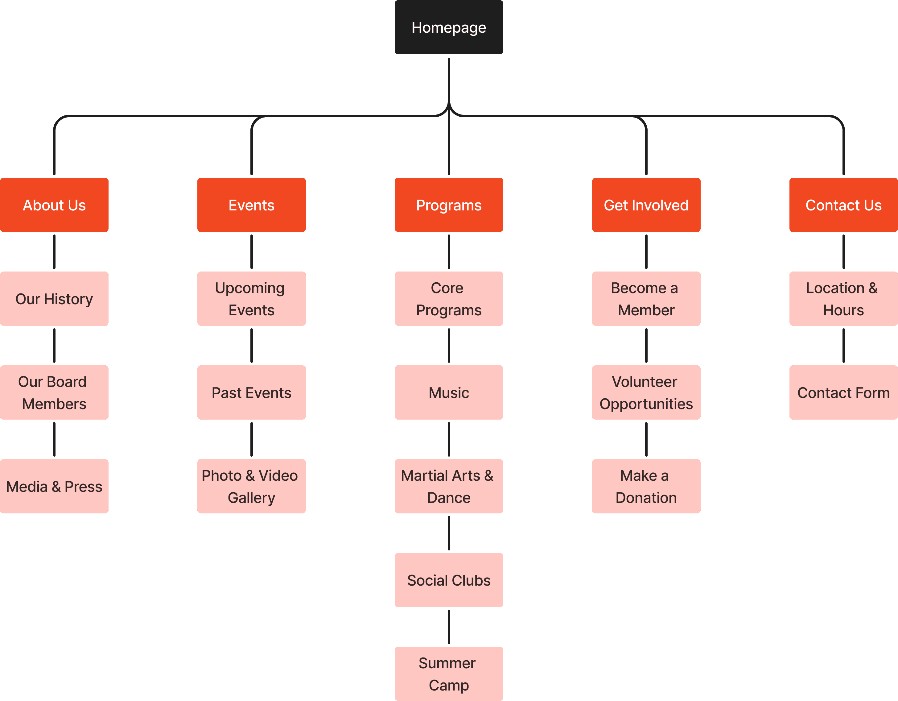
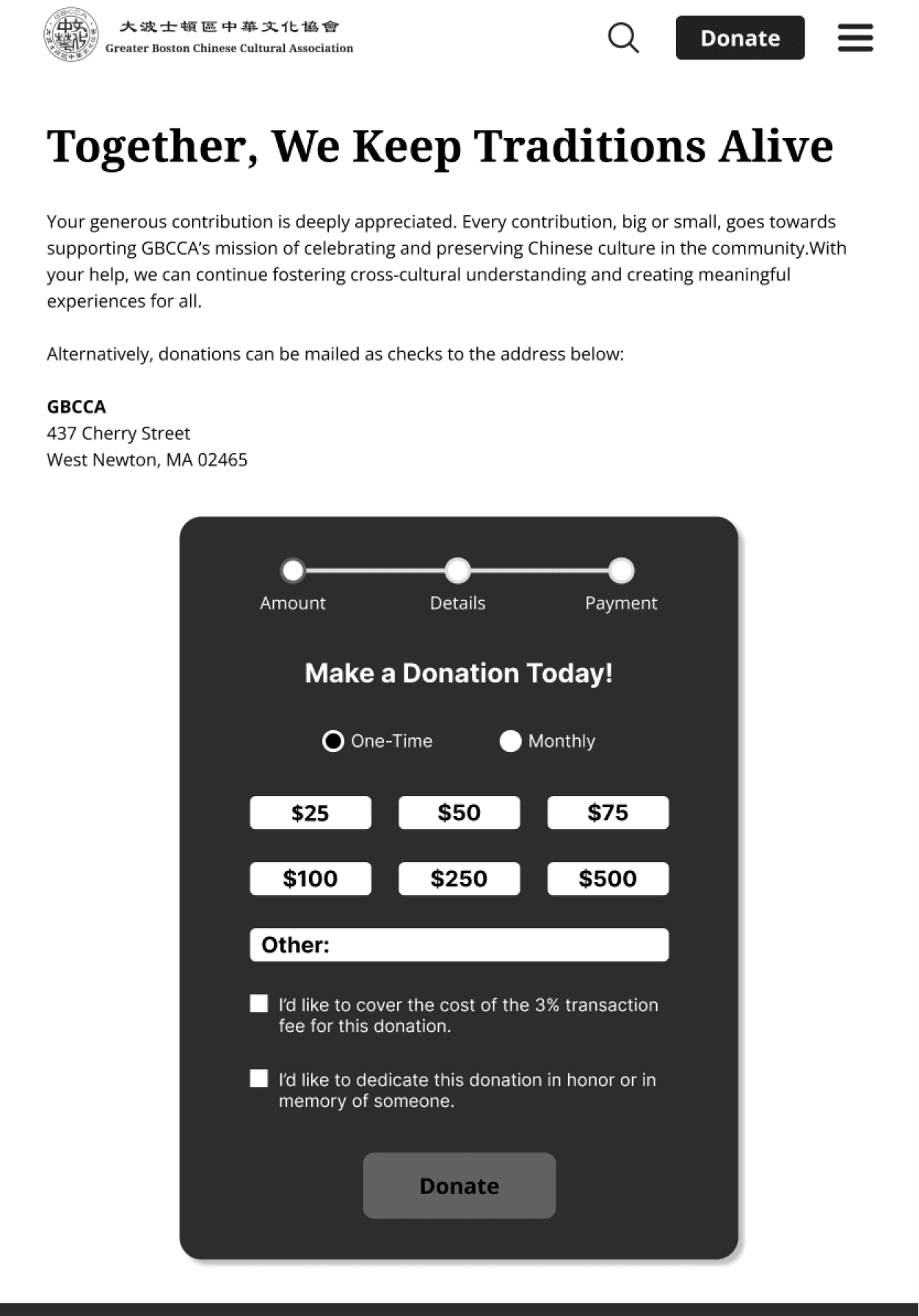
Sitemap
Using the results of the card sort study, I was able to create an intuitive sitemap I would later use as a reference during the creation of user and task flows, page designs, and tasks for usability tests of my mid-fidelity and high-fidelity wireframes.
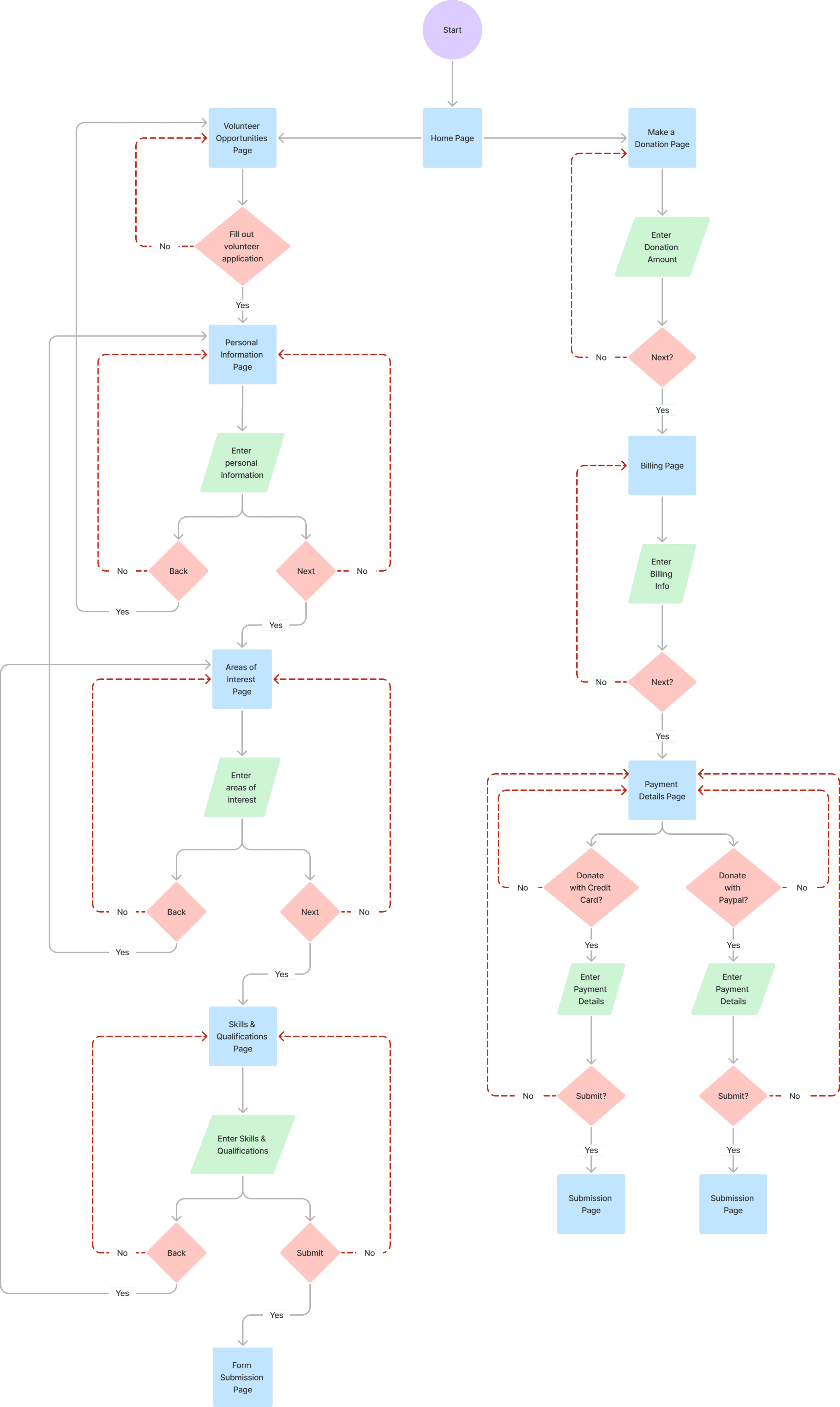
Task Flows
I then created the 2 task flows shown below which would be used as tasks for participants to complete during the mid-fidelity and high-fidelity wireframe usability tests:
Key
Navigate to and fill out the volunteer application form

Make an online donation using a credit card

User Flows
Based on my task flows, I created the corresponding user flows to understand how a user would interact with my design. These flows would determine the pages that would need to be built out for my wireframes and help to ensure that the tasks given to users during usability tests would flow smoothly.
Wireframes
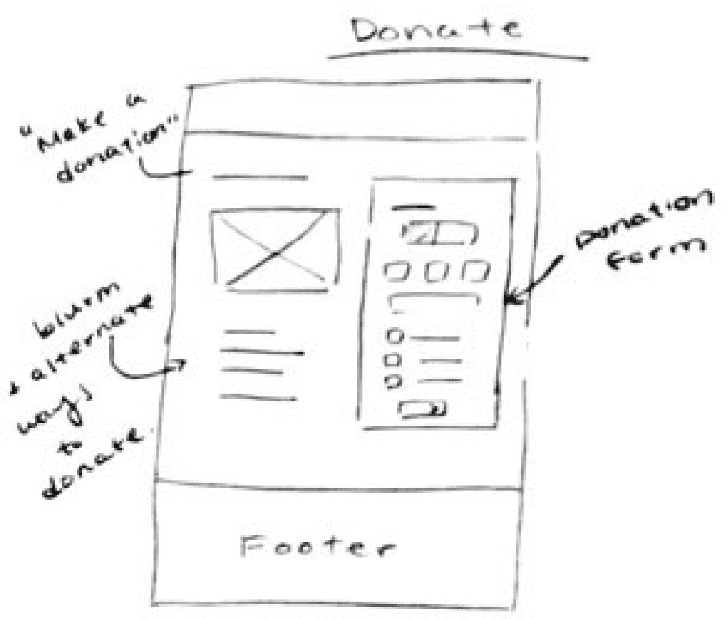
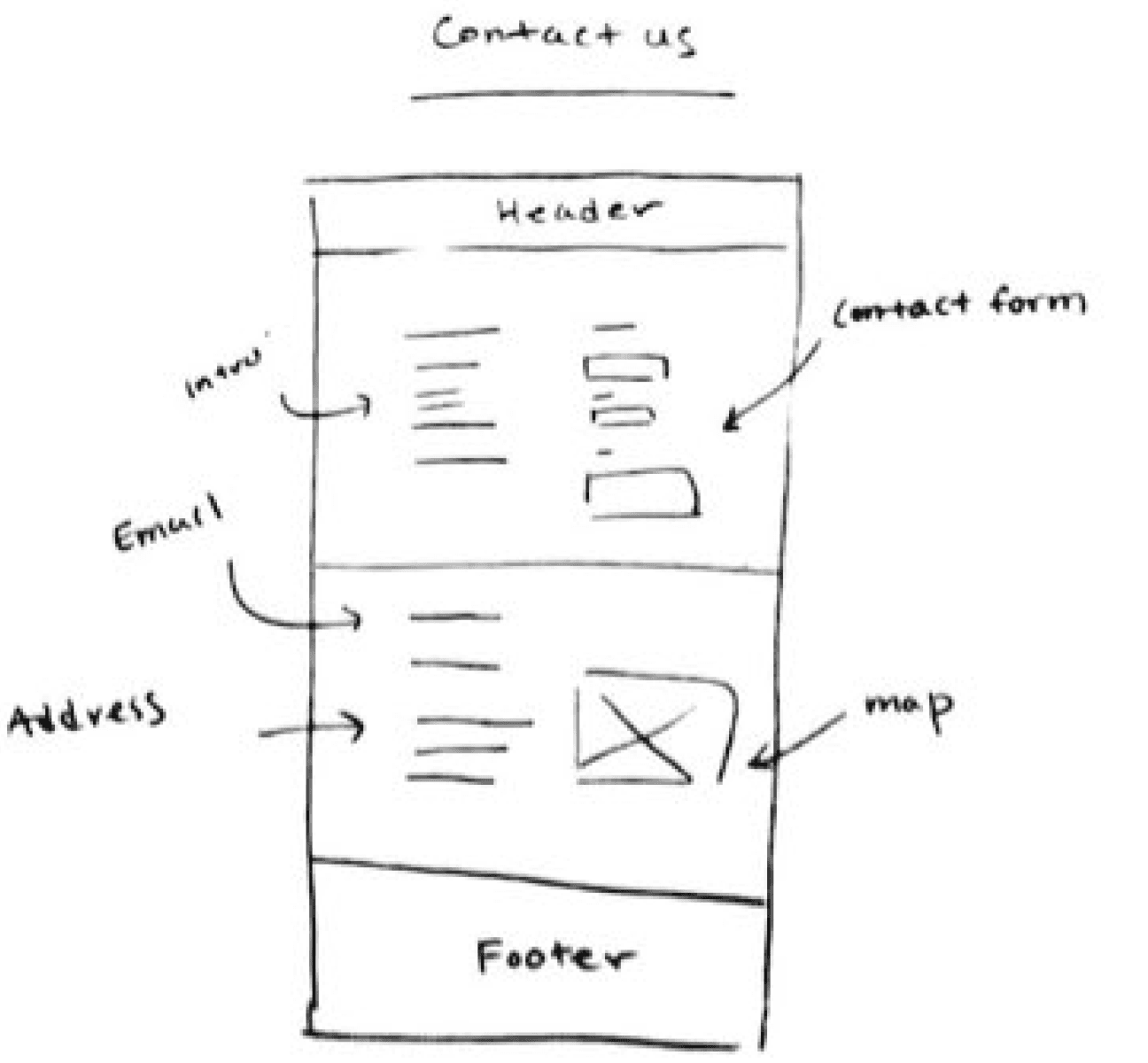
Low-fidelity Wireframes
I began by sketching out low-fidelity desktop wireframes of my website design. Here are some of the key screens I drafted that I would then transition to my mid-fidelity wireframes along with the pages from my flows:
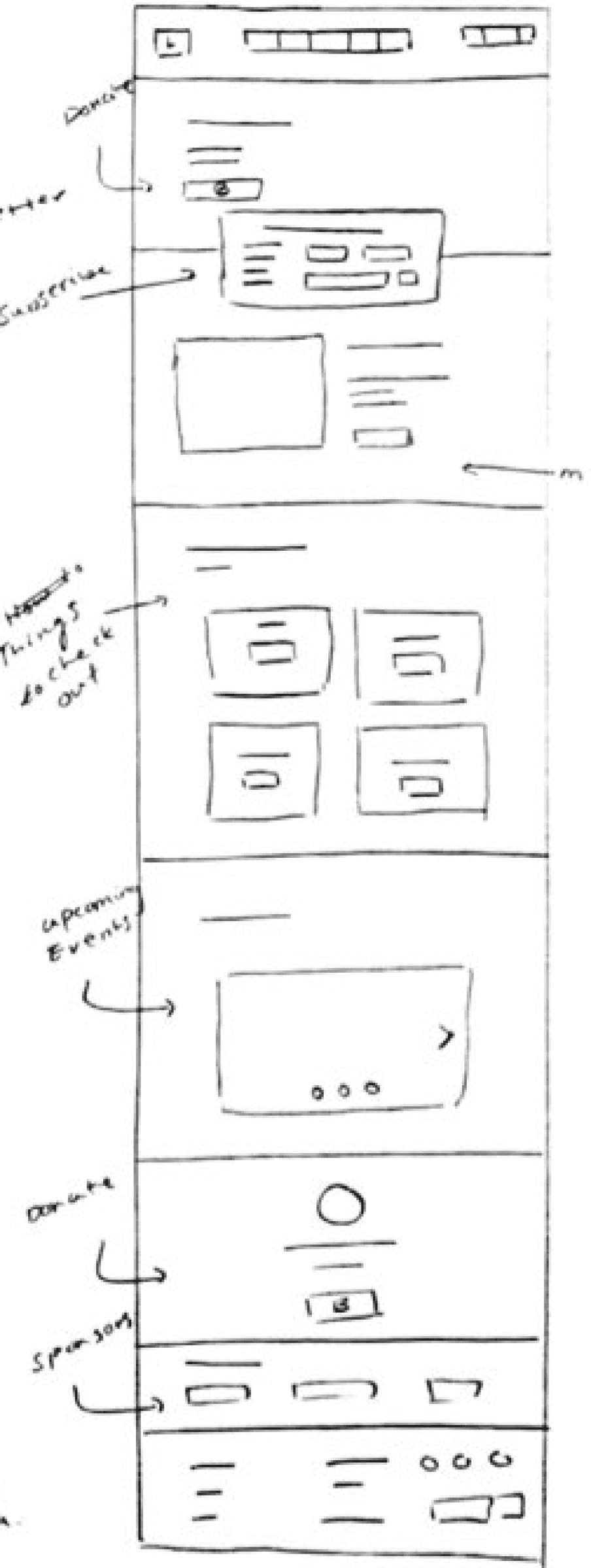
Homepage
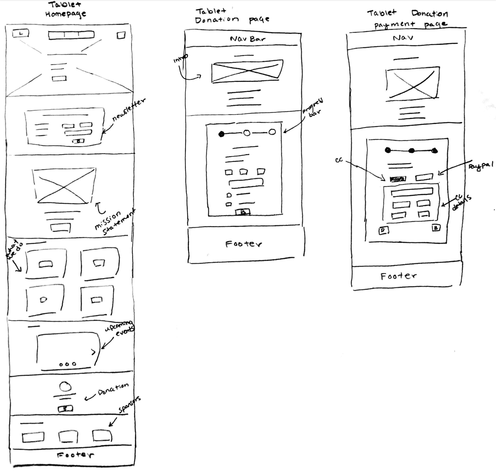
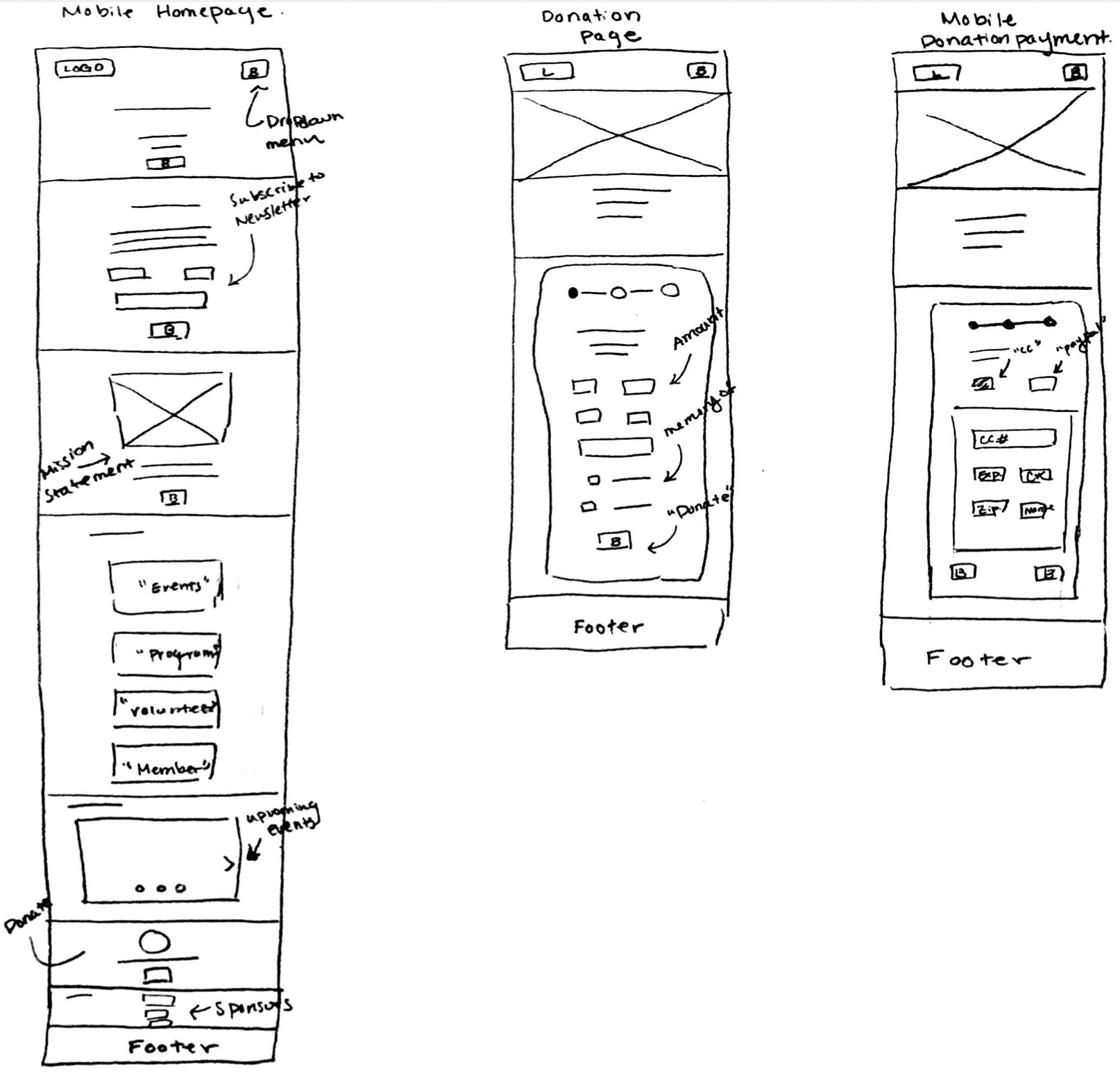
I then sketched out a few key pages of the donation flow for both tablet and mobile wireframes:
Tablet Low-Fidelity Wireframes
Mobile Low-Fidelity Wireframes
Mid-fidelity Wireframes
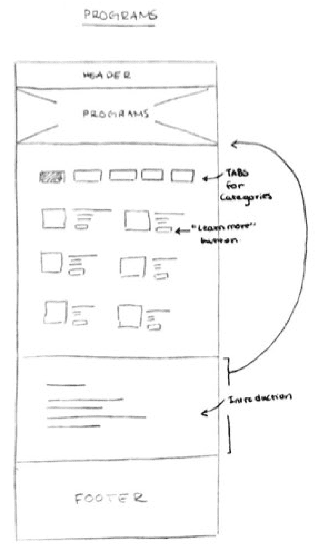
I proceeded to create mid-fidelity desktop wireframes of all navigation pages and the pages for my task flows. Here are some of the key pages I created:
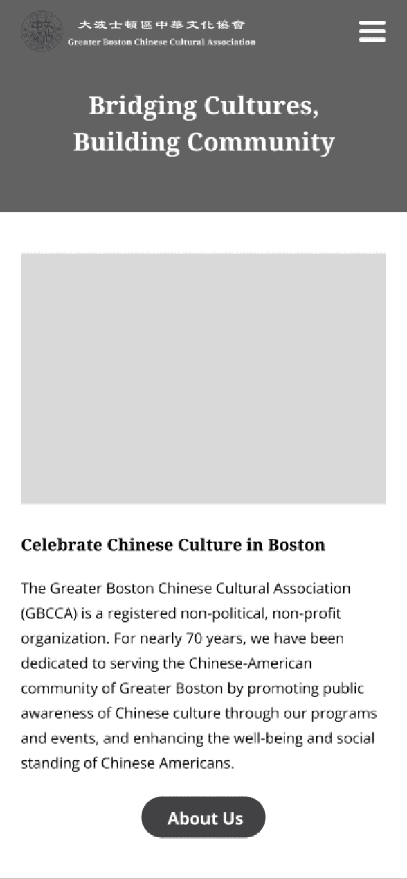
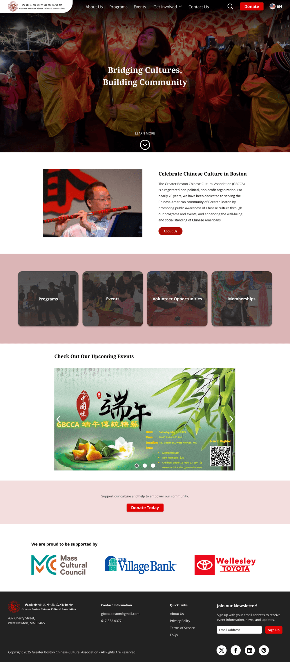
Homepage
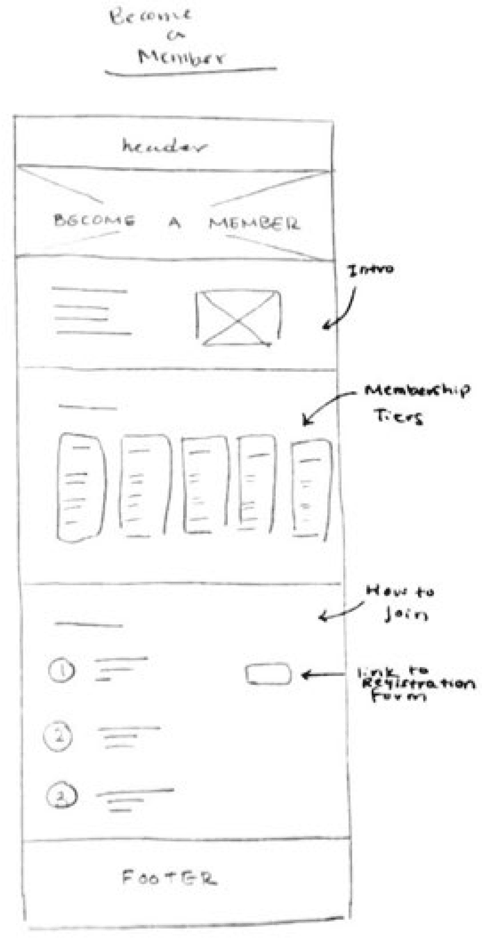
Membership Page
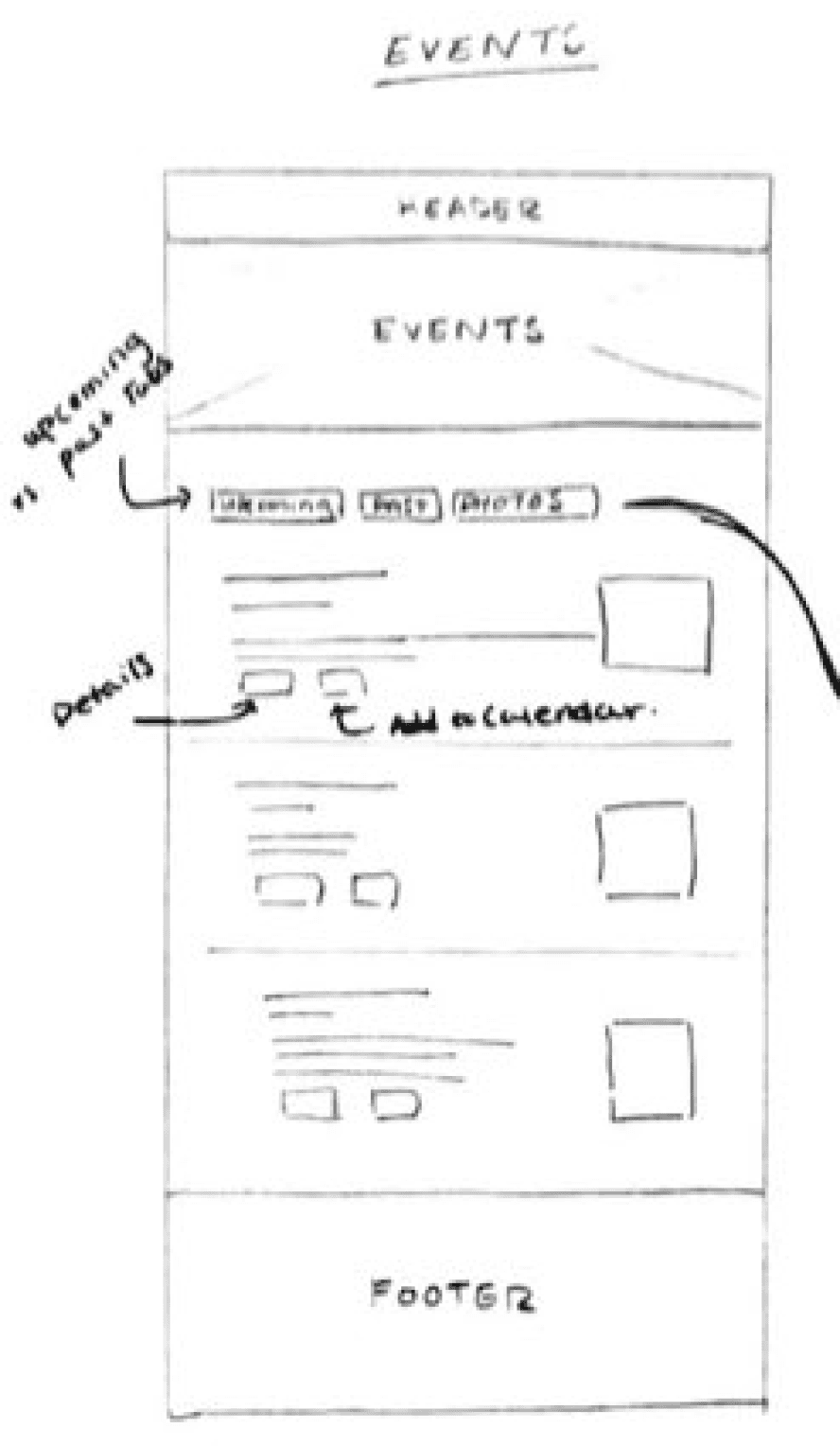
Events Page
Volunteer Page
Donation Page
Mid-Fidelity Usability Testing
To ensure a seamless experience, I conducted mid-fidelity usability tests between 4 participants on the desktop pages. Participants were asked to perform 3 tasks:
Task 1: Look through the pages on the website and feel free to comment on anything that stands out to you.
Task 2: You’d like to volunteer for the organization, please find and complete the “Volunteer Application”.
Task 3: You would like to make a $25 donation to the organization through the website.
Success was measured by the following metrics:
Completion of the tasks
Sufficient information on pages that answer questions a website user might have
Ease of navigation through the website
Time it took to complete the task
Number of clicks that strayed from the task flow
Consistencies in user behaviors
Mid-fidelity Usability Test Results:
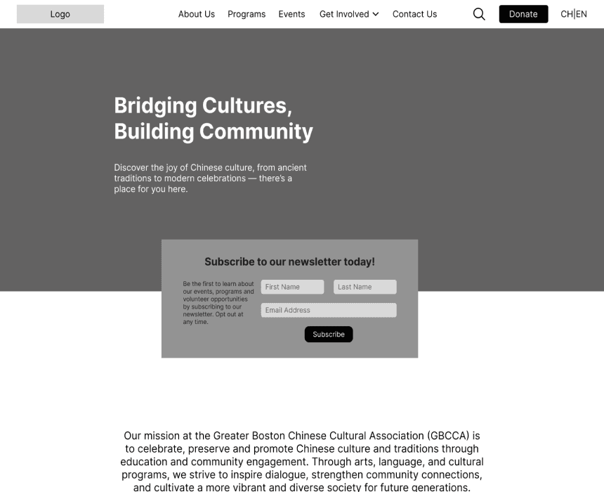
During the first task of looking through all the mid-fidelity pages, I was able to get a lot of insightful information on how to improve the usability of the pages. Most notably were comments on the sizes and spacing of text boxes to help improve the legibility of information on the site. In addition, multiple participants found the placement of the newsletter signup box on the homepage confusing and out of place. To address this, I decided that it was necessary to change this CTA and reconsider what the primary action on the homepage should be.
The second and third tasks of completing 2 forms were completed easily and some great suggestions on how the questions on the application form could be improved were given.
Iterations
Below are the highlights of important iterations made based on the results of the mid-fidelity usability tests:
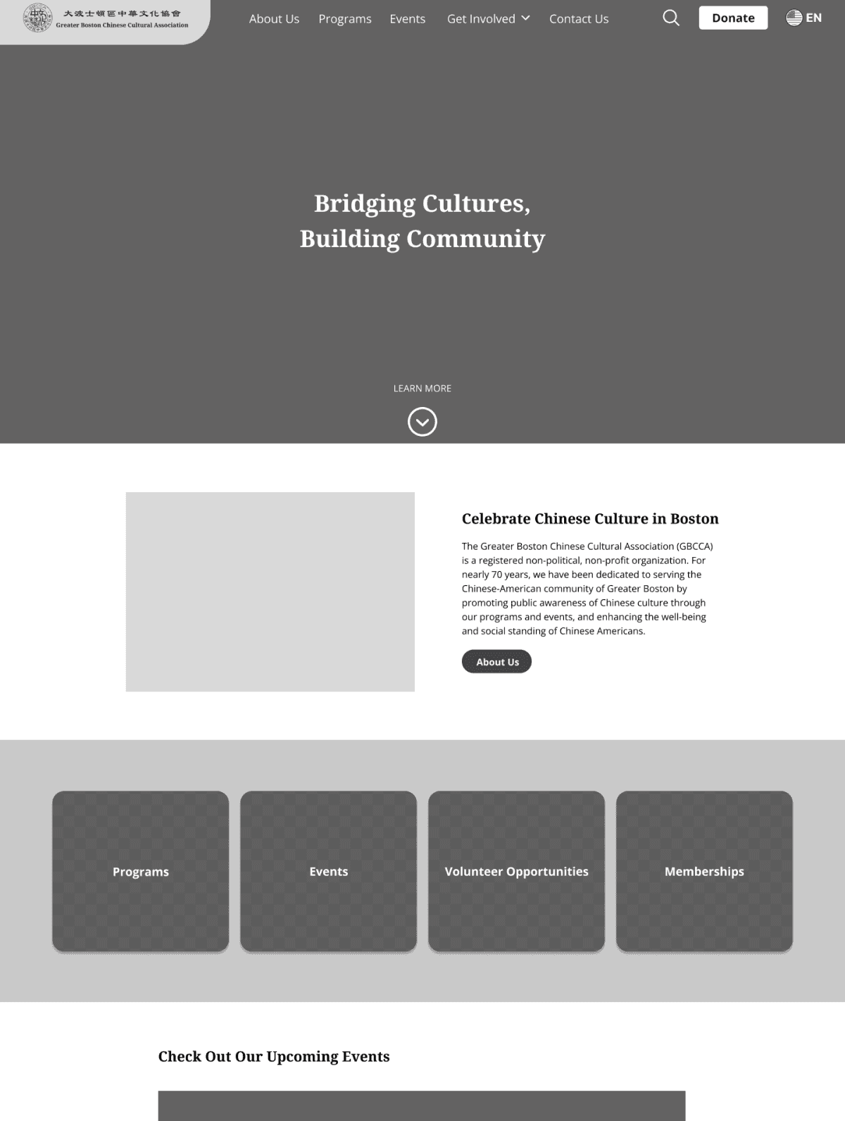
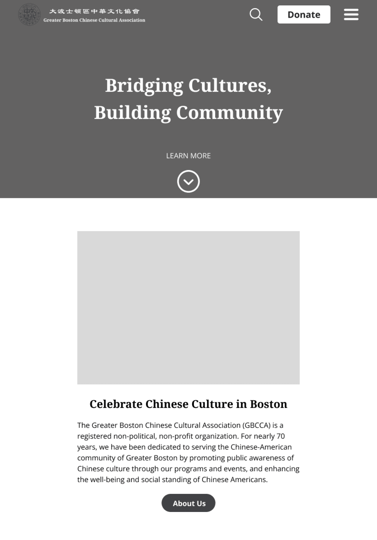
Homepage
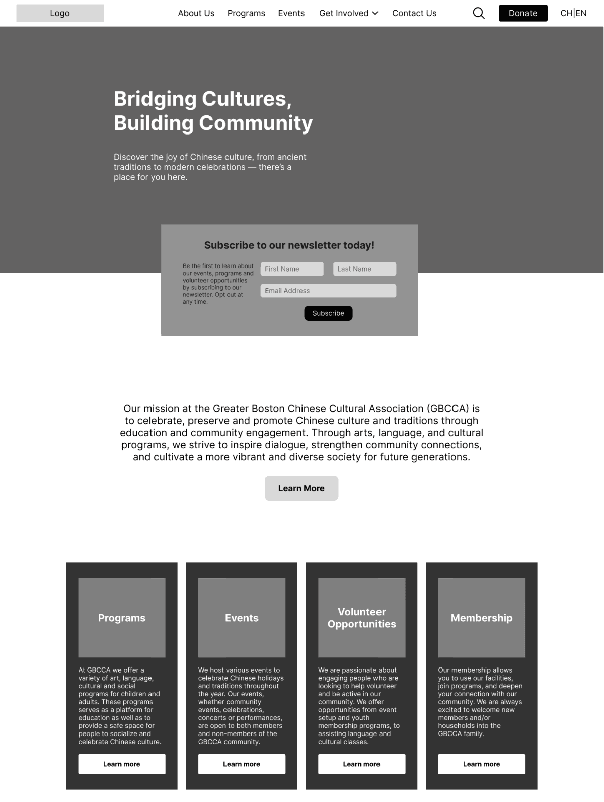
Feedback from Usability Tests
Depiction of the language option was changed due to confusion on what it meant
Subscription to the newsletter box was removed because it interrupted the flow of the page and a photo for the introduction to the organization was added
Language of the “Learn More” button was changed to “About Us” for better understanding
Boxes containing information on what the organization offers were made to have rounder edges for a softer look and now flip when hovered over to make the information more legible.
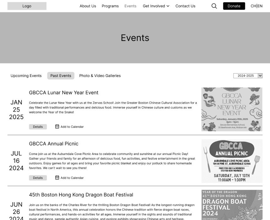
Event Page
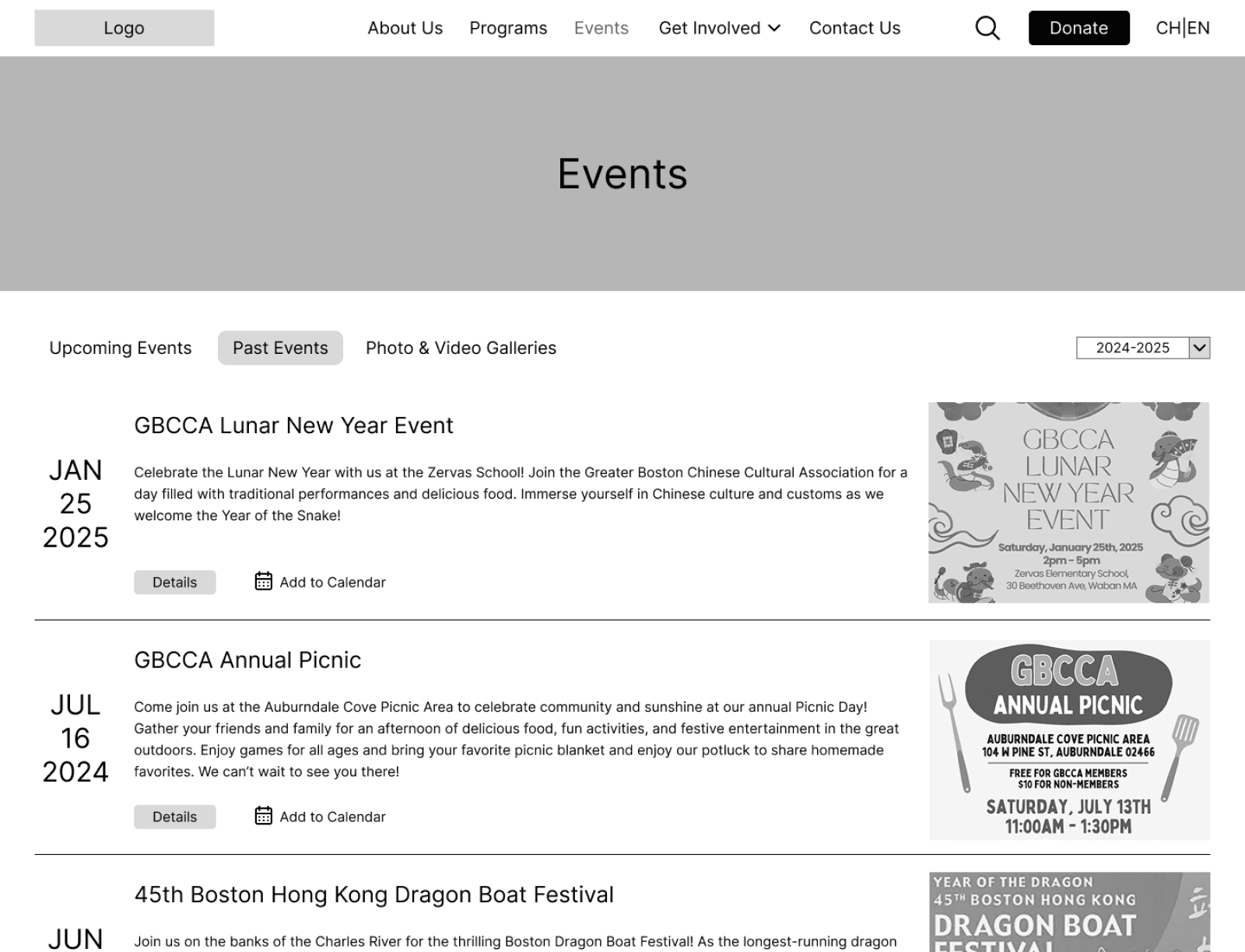
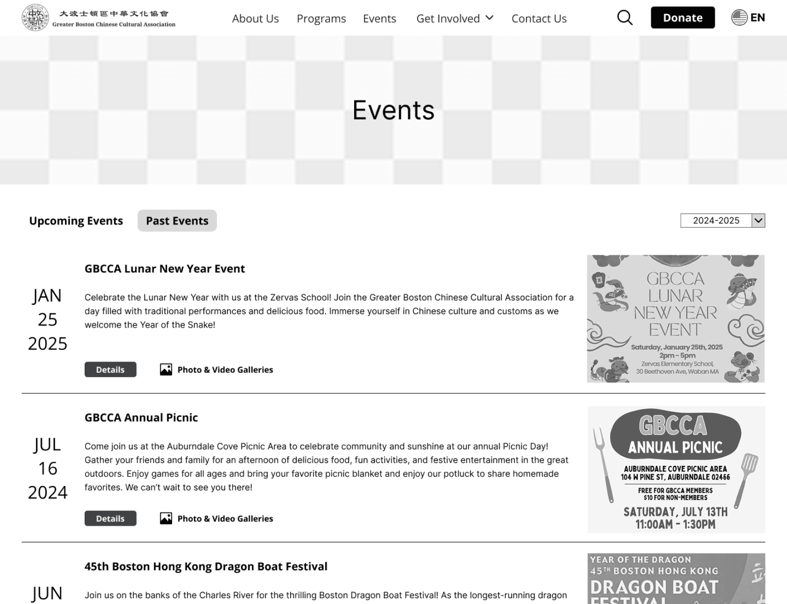
Feedback from Usability Tests
The “Photo & Video Galleries” was moved from the navigation to individual events in “Past Events”
Font size for the title of each event was made smaller for better legibility
Font size for event descriptions were made larger for better legibility
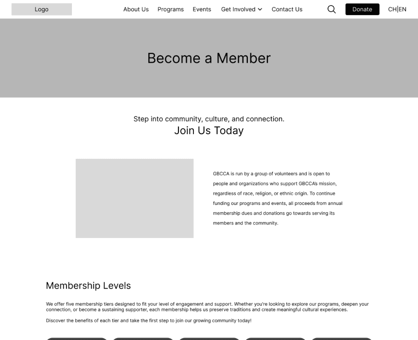
Membership Pages
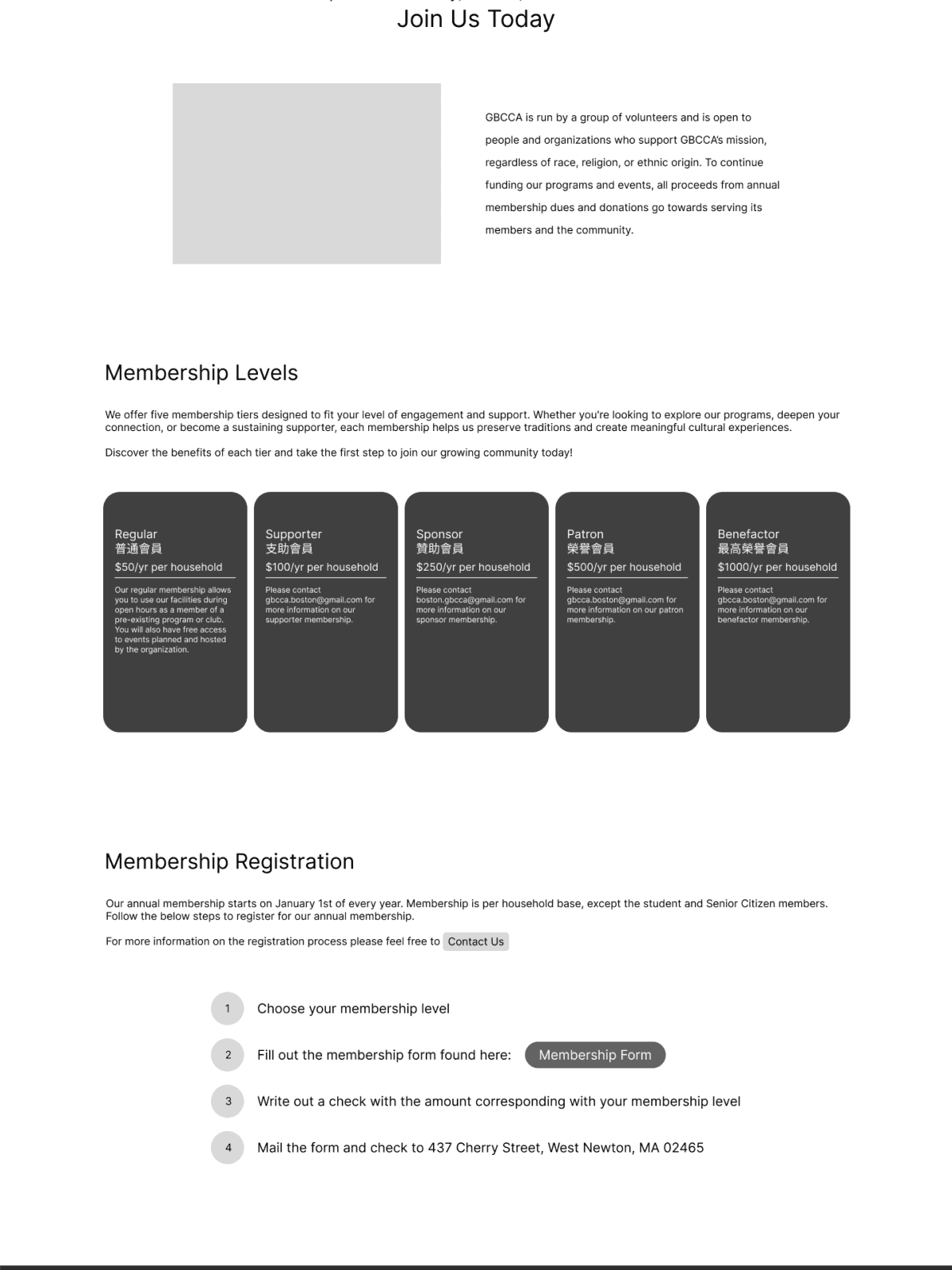
Feedback from Usability Tests
Regular membership was separated as the main membership level that the organization recognizes as the most common membership choice
Text sizes were adjusted (headline sizes decreased and informational text sizes increased) for better legibility
More information on what to expect after sending in your membership application was added
Four of the membership levels were categorized as “sponsorships” due to the nature of the membership
Responsive Mid-Fidelity Wireframes
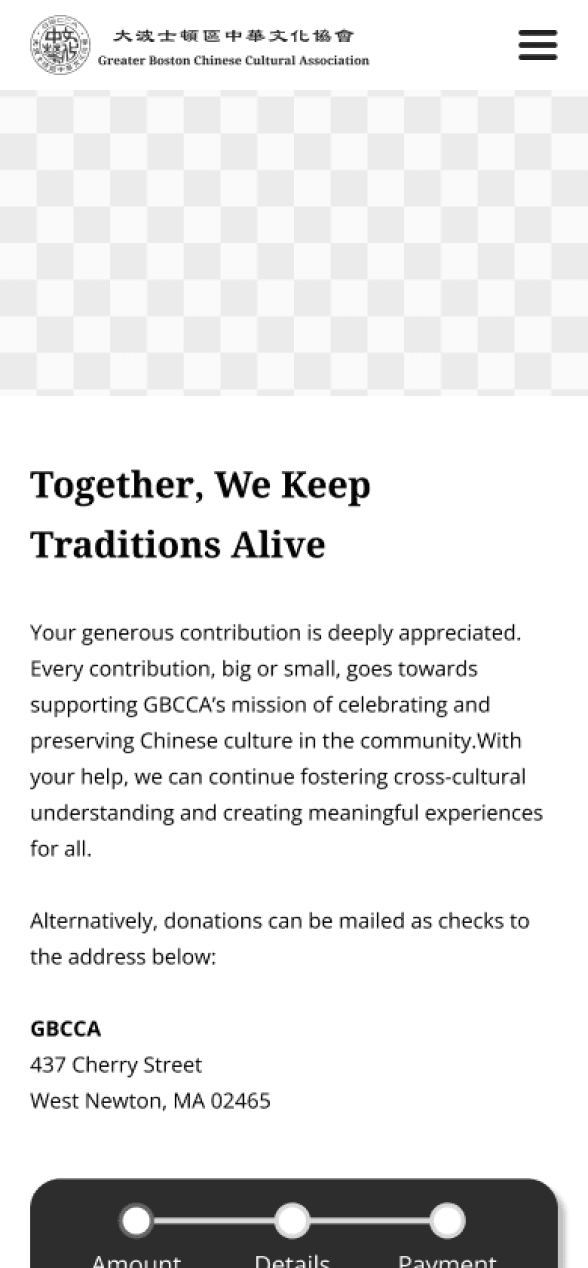
With my iterations for my mid-fidelity desktop wireframes, I designed responsive pages for the "donation form" task flow in both tablet and mobile screen sizes:
Tablet Mid-Fidelity Wireframes
Mobile Mid-Fidelity Wireframes
Branding and Styling
With almost 70 years of history, the GBCCA branding and styling had been well established leaving little need for major changes. Instead, I created a visual system inspired by their current website so that I could ensure consistency across all elements of the website.
大波士頓區中華文化協會
Greater Boston Chinese Cultural Association
Color Styles
Primary Colors
#570B0D
#811113
Secondary Colors
#AB0808
#E00404
#DBB5B6
#F3DEDE
Neutral Colors
#222222
#424347
#8F8F8F
#FFFFFF
Typography
Droid Serif, 40px
H1
Droid Serif Bold, 24px
H2
Open Sans Bold, 20px
H3
Open Sans Bold, 15px
Buttons/CTA
Open Sans, 16px
Body 1
Open Sans, 14px
Body 2
High-Fidelity Wireframes and Usability Test
Wireframes
Using my visual system as a reference, I transitioned my mid-fidelity desktop wireframes into high-fidelity wireframes, ensuring consistency of typography and color styles before conducting a second round of usability tests.
High-Fidelity Usability Testing
To ensure smooth and intuitive navigation throughout the wireframes and verify the visibility and legibility of the page stylings, high-fidelity usability tests for my desktop wireframes were conducted with 3 participants who were asked to perform the same tasks as in the mid-fidelity usability tests.
Success was measured by the same metrics as the mid-fidelity usability tests as well.
Hi-fidelity Usability Test Results
The overall feedback on design, navigation, and text size/legibility were very positive with mostly minor suggestions on wording choices, layouts, and differences in preferences with color choices. In addition, both tasks involving the completion of a form were completed smoothly by all participants.
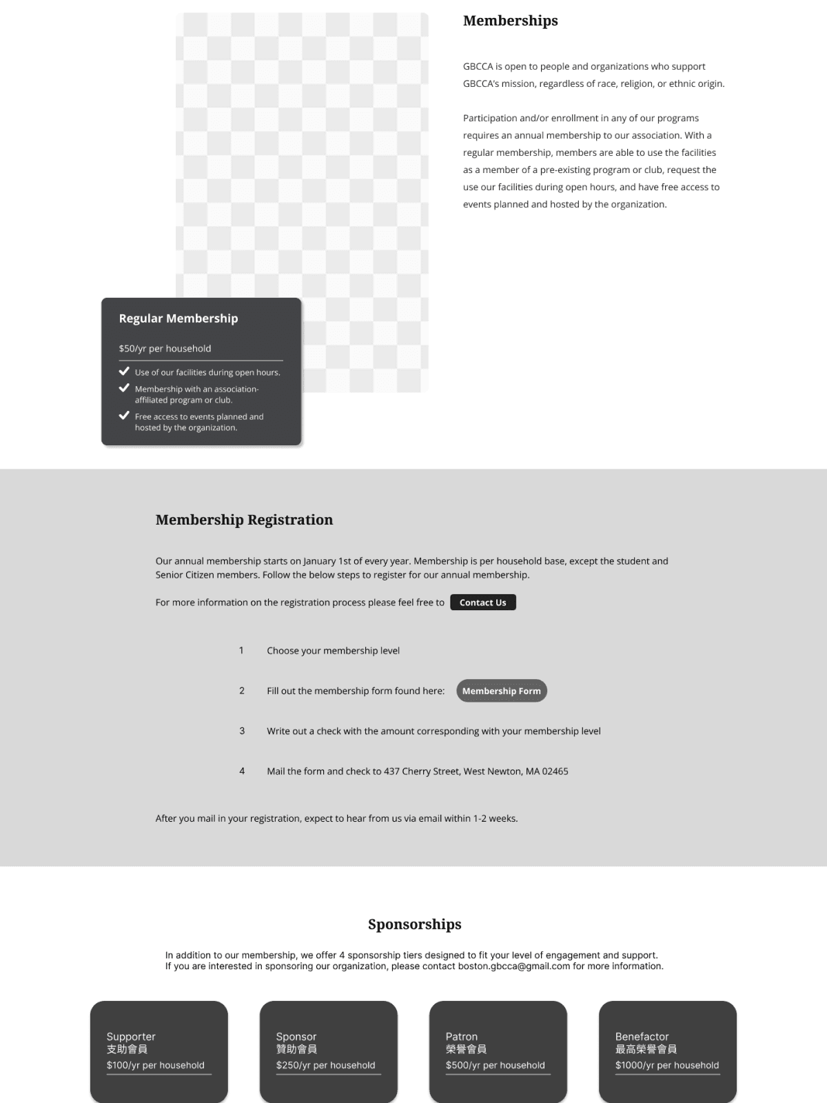
The one major comment made by 2 participants was wanting more information on what a sponsorship entails on the “Membership” page. To address this, I decided to make changes to the layout of the page so that the information flows better, and to add additional information to the page to help users understand the difference between a sponsorship versus a regular membership.
Iterations
Below are some of the highlights of the iterations I made on my high-fidelity wireframes based on the results of the usability test.
Homepage
Feedback from Usability Tests
The height for the upcoming events section was increased to maintain consistency with other sections
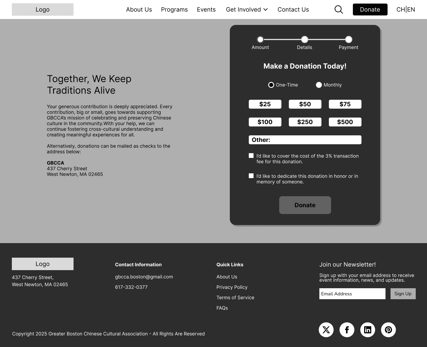
The color for the frame of the donation section was changed to improve visibility of the text
Programs Page
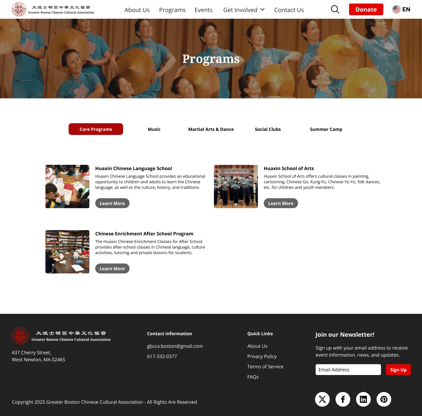
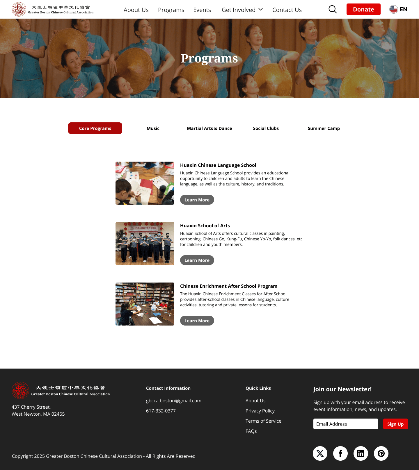
Feedback from Usability Tests
Users preferred for the programs to be displayed in a single centered column on the page
Membership Page
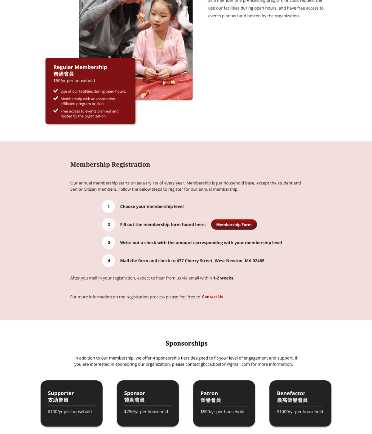
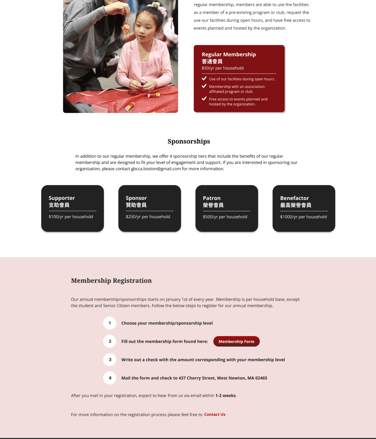
Feedback from Usability Tests
Users preferred the look of moving the “Regular Membership” box down to align with the text above
Additional information on sponsorships was added to clarify what it is
The order of sections on the page was changed so that the sponsorship section was above the membership registration which created a better flow of information on the page
High-Fidelity Responsive Wireframes
With my final desktop iterations in place, I designed responsive screens of the “donation” task flow for tablet and mobile screens, ensuring that all text was legible and that buttons were modified to fit finger touchpoints.
Tablet High-Fidelity Wireframes
Mobile High-Fidelity Wireframes
Reflection
Redesigning GBCCA’s website was a rewarding and meaningful experience that allowed allowed me to explore the importance of creating a user-friendly interface that could resonate across generations—whether it was a younger user exploring involvement opportunities or an elder looking for event information. I prioritized accessibility, intuitive site navigation, and tablet and mobile responsiveness, knowing that the site would be a bridge connecting Chinese culture with local communities.
One of the greatest challenges I faced throughout this project was making key design decisions without the input of a stakeholder. However, this also gave me the chance to put myself in a stakeholder’s shoes and make decisions such as categorizing programs and providing information on membership benefits based on how I believe the design would best align with both business and user goals.
Next Steps
Collaboration with organization leaders - Reaching out to the current leadership of the organization to survey potential interest in redesigning their site.
User testing and feedback - Testing the usability of the site and making improvements based on feedback from members of the organization, native Chinese speakers, and older community members
Content Optimization - Refining and translating content for clarity, better alignment with business goals, and SEO.
Building Community Engagement Features - Creating a mailing list for newsletter subscriptions and volunteer applications, and adding more interactive elements such as event registrations.